Food Alert
2018 – 2019
- Interaction design
- Web design
- Web development
Together with an amazing team of developers, I designed a tool to help event hosts share food with food-insecure students at the University of Washington.
What's the problem?
A surplus of high-quality food is often left over after catered or hosted events at the UW. No one wants to throw it away, but getting the food to those who need it most is logistically challenging.
We created a tool to help reduce food insecurity among students and others at all three UW campuses—and reduce food waste at the same time.
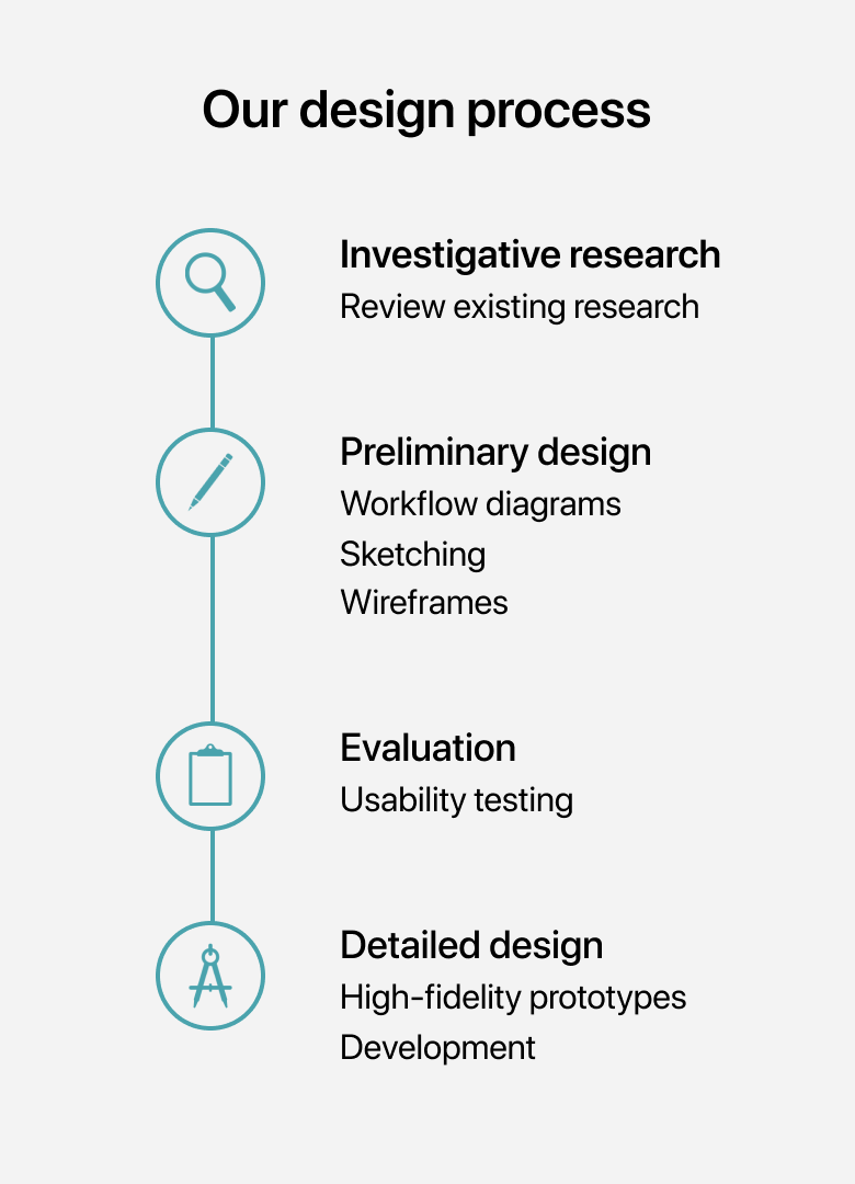
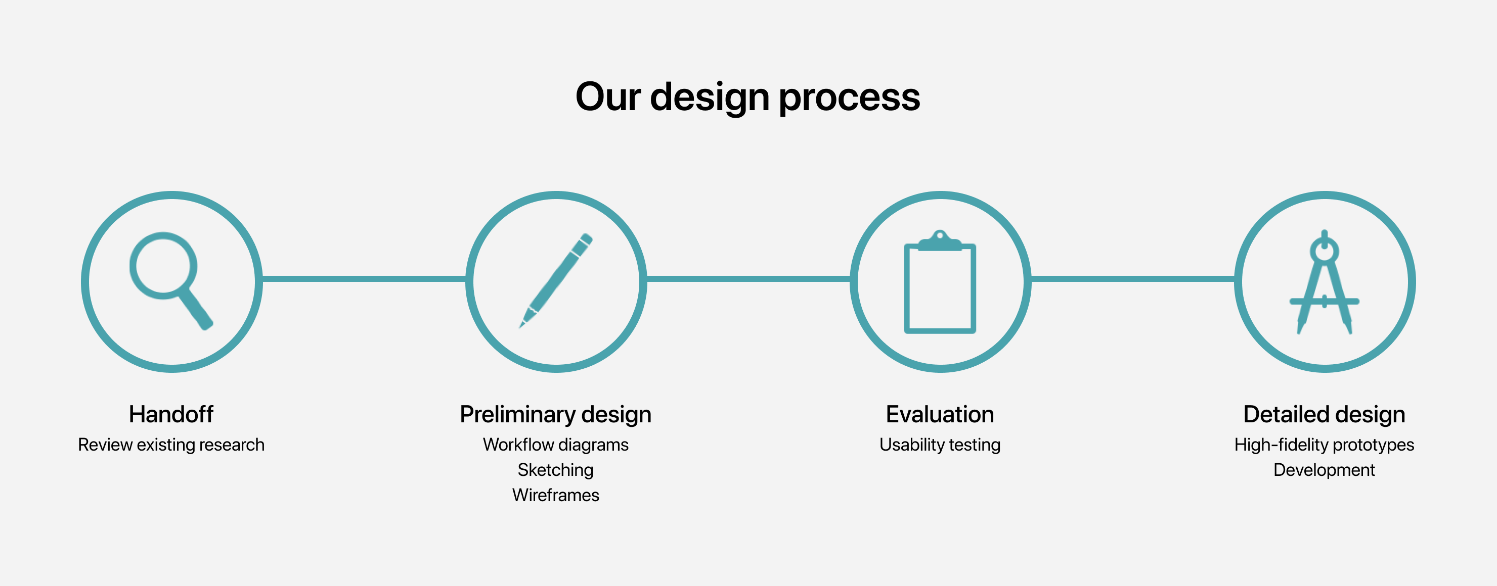
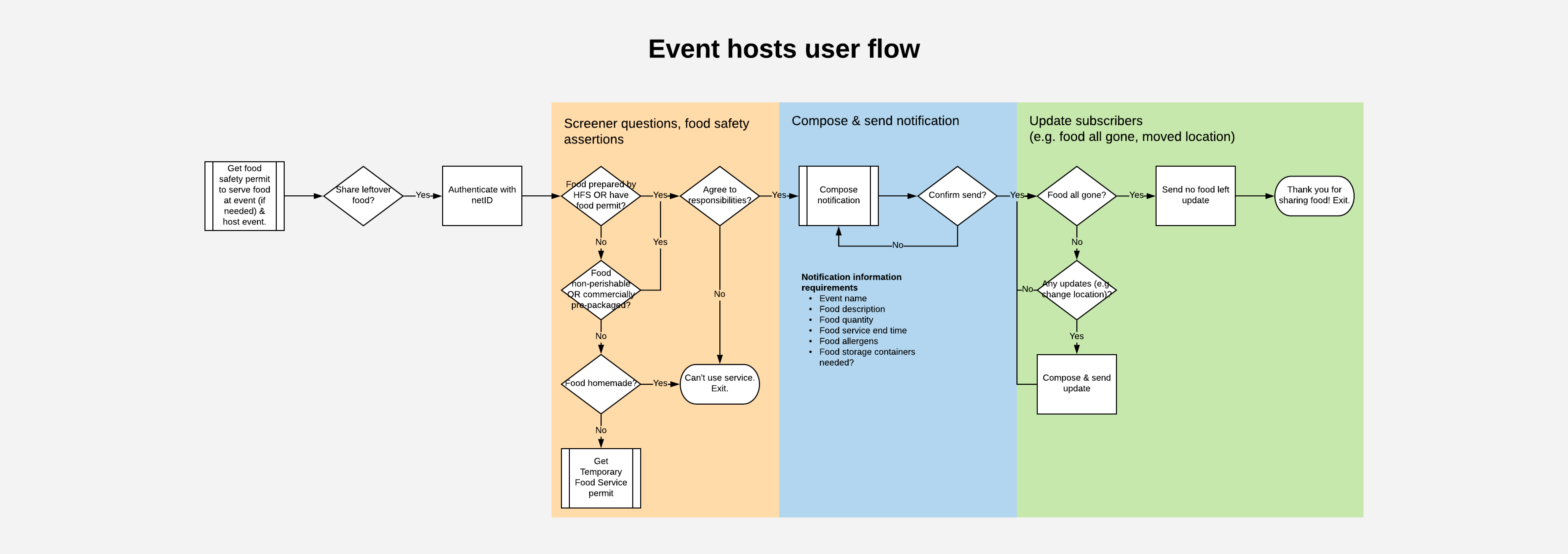
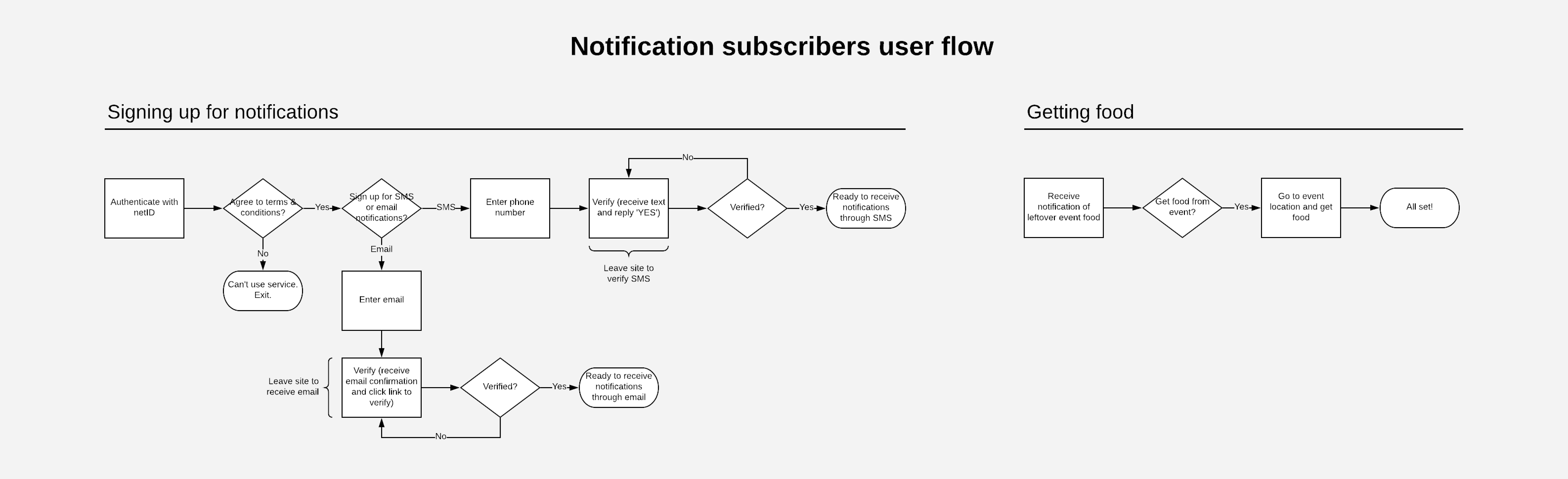
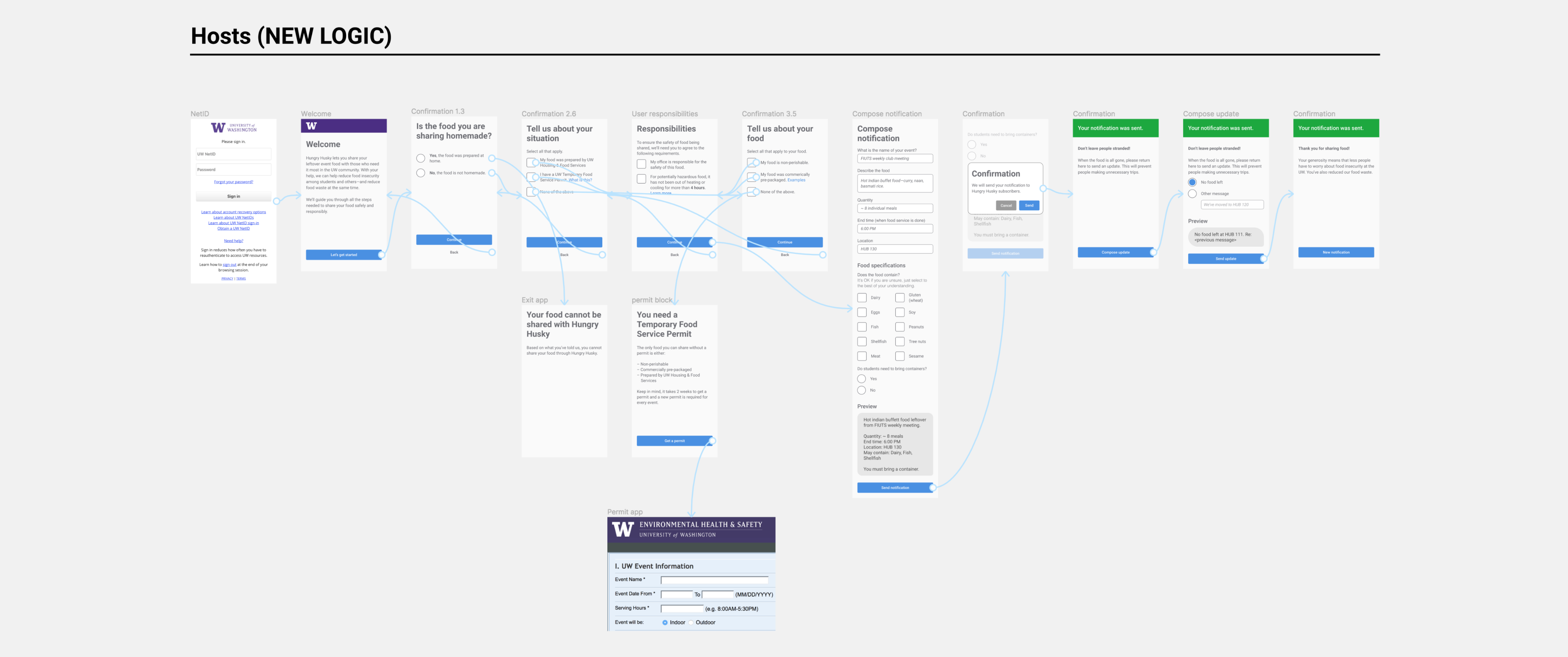
Workflows for task understanding
Learning from research done prior to my joining the team, my project manager and I mapped out specific tasks that our two user groups would need to accomplish in the following workflows. Starting with workflows was formative for the project because it required me to focus and drill down into the key tasks that users needed to accomplish in using the site.
To ensure safety of food being shared, we made sure that our workflows included compliance with University and State food sharing policies.
Two user groups
Sketching interfaces
The workflows provided a thorough depiction of the tasks and procedures that our users would need to complete. I then sketched various ways to embody the workflows in interfaces that users would interact with.
Event hosts have to meet certain criteria in order to share their food with the public. At the UW, it means either having the food prepared by campus caterers, having a University issued food permit, or serving non-perishable or commercially pre-packaged food. One of the things I struggled with was thinking through how best to screen for these criteria with the interface.
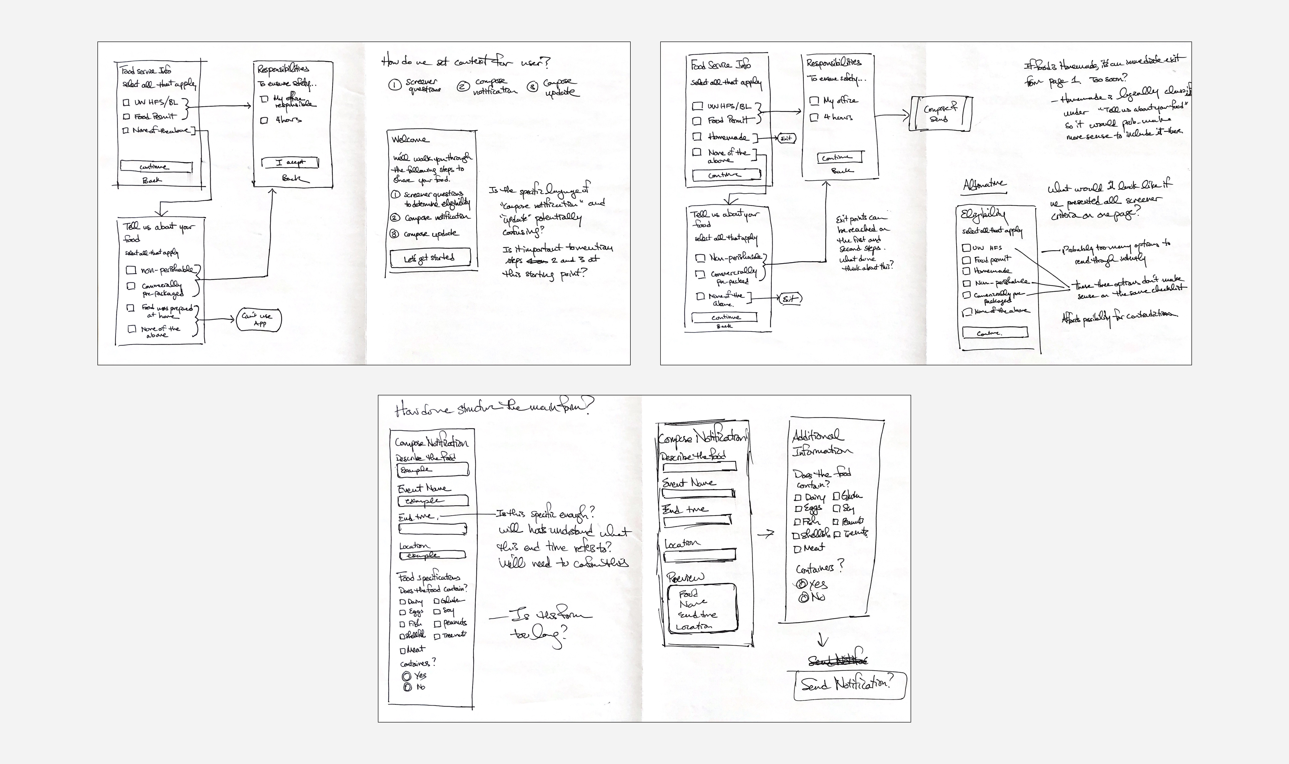
Wireframes
I shared my sketches with the project manager for feedback and then created wireframes to iterate on layout and prioritization of space for specific content. I decided to include the actual content in the wireframes as opposed to filler text to achieve a higher fidelity appropriate for usability testing.
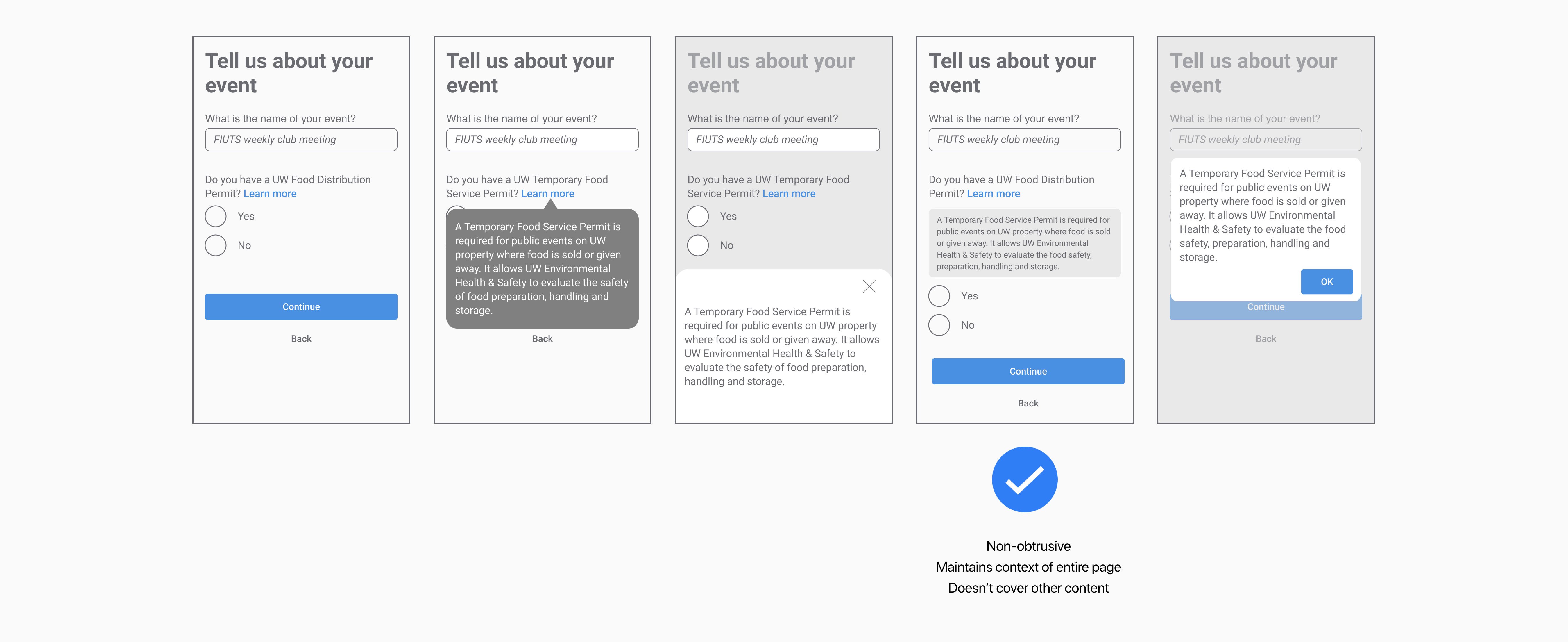
Iterating patterns
There were a number of views in our interface that I wasn’t sure how to design, or even what design would be the most effective. So I iterated over a handful of design components and got feedback from the team and other designers in our group.
Usability testing
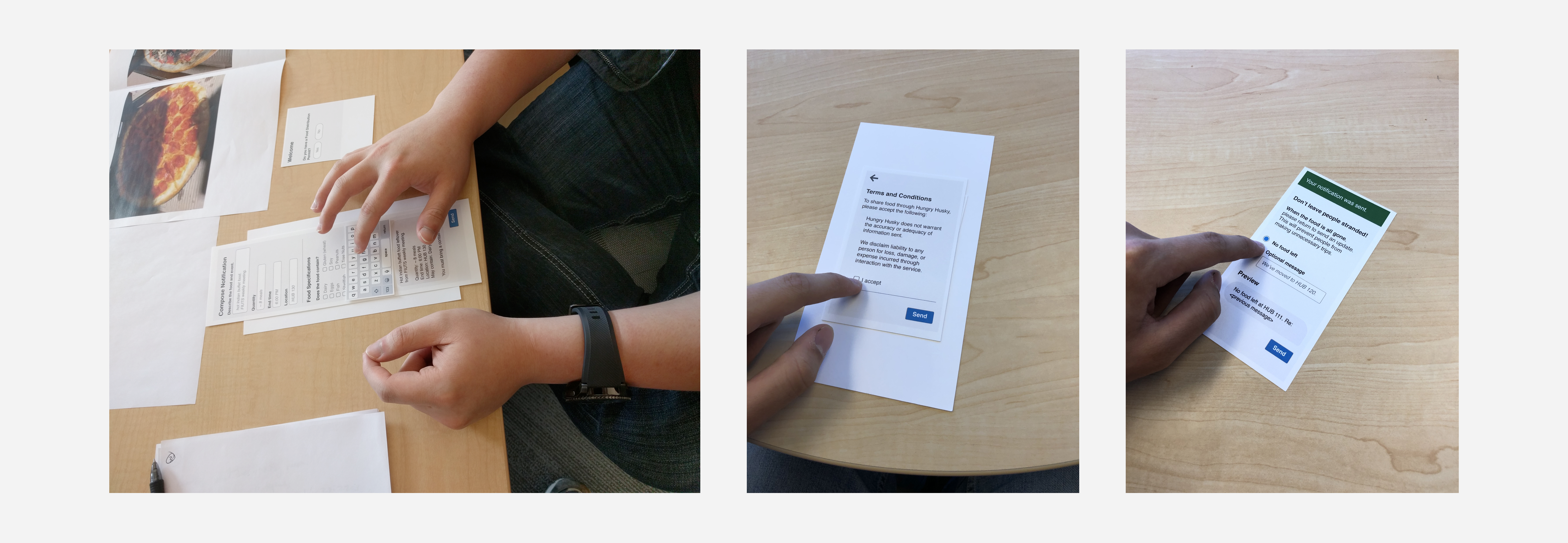
After creating the prototypes, we wanted to test them to see how effective and understandable they were. I printed the designs on card-stock, created different scenarios and tasks, and tested them with seven users.
Key findings
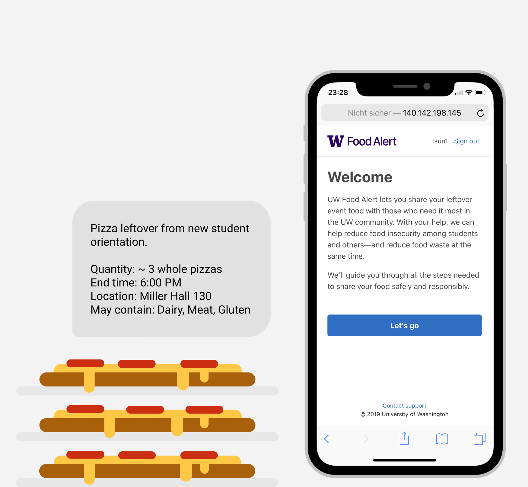
Ambiguous form labels. Participants expressed confusion over content required from hosts on the main form page. Specifically, the food quantity and event end time were unclear to participants and needed further clarification, which the interface did not provide.
Unfamiliarity with Food Service Permits. A few participants did not know what a Food Service Permit was or when it was required. Since the interface did not provide explanation, they did not know whether or how to proceed.
Interface isn’t inordinately taxing to use. Participants reported at the end of the study that the process was straightforward and did not take more time than they expected or wanted to complete. With the exception of ambitious form labels and unfamiliar terms, the ability of the interface to support user workflows seemed to be positive.
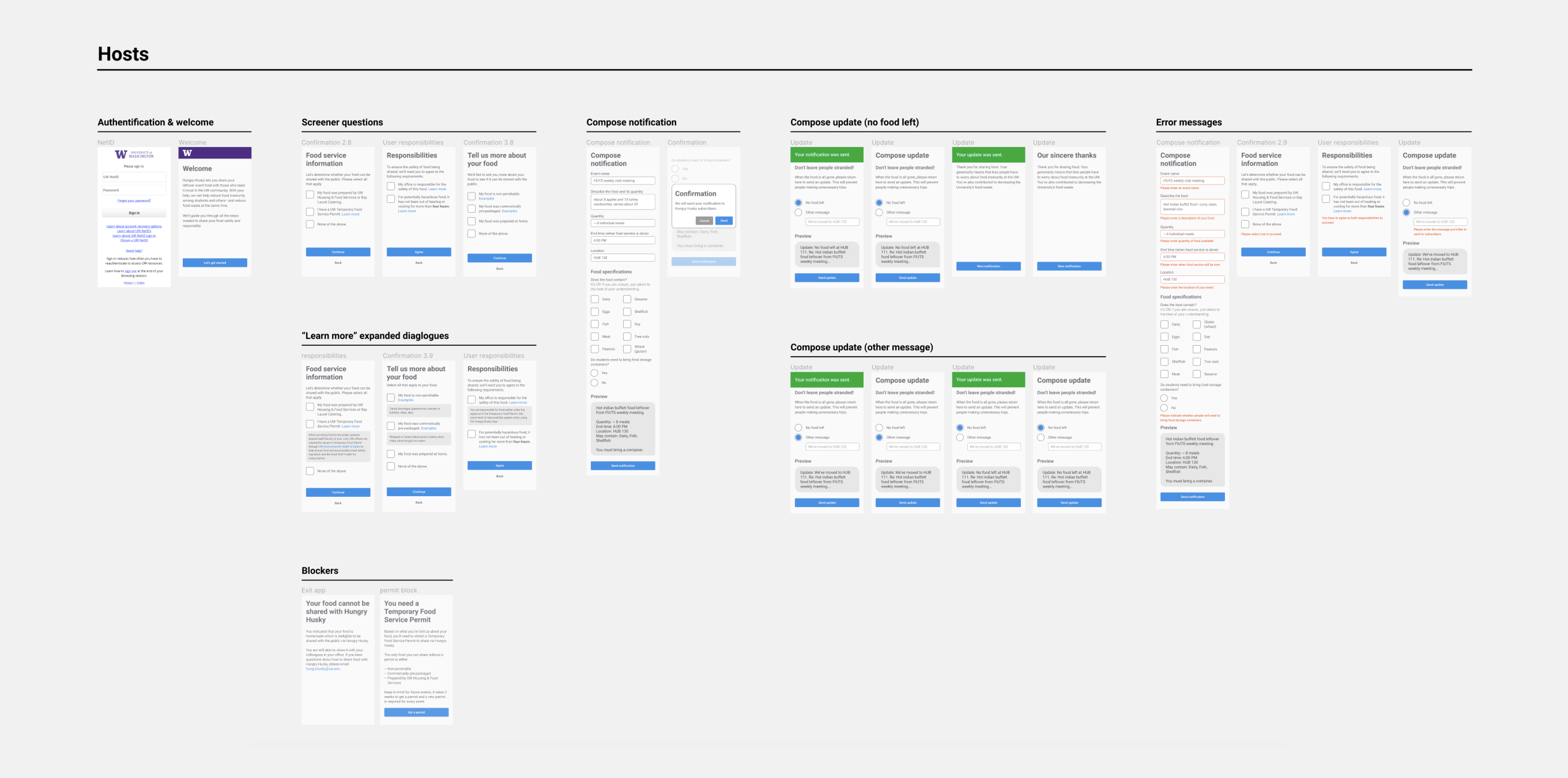
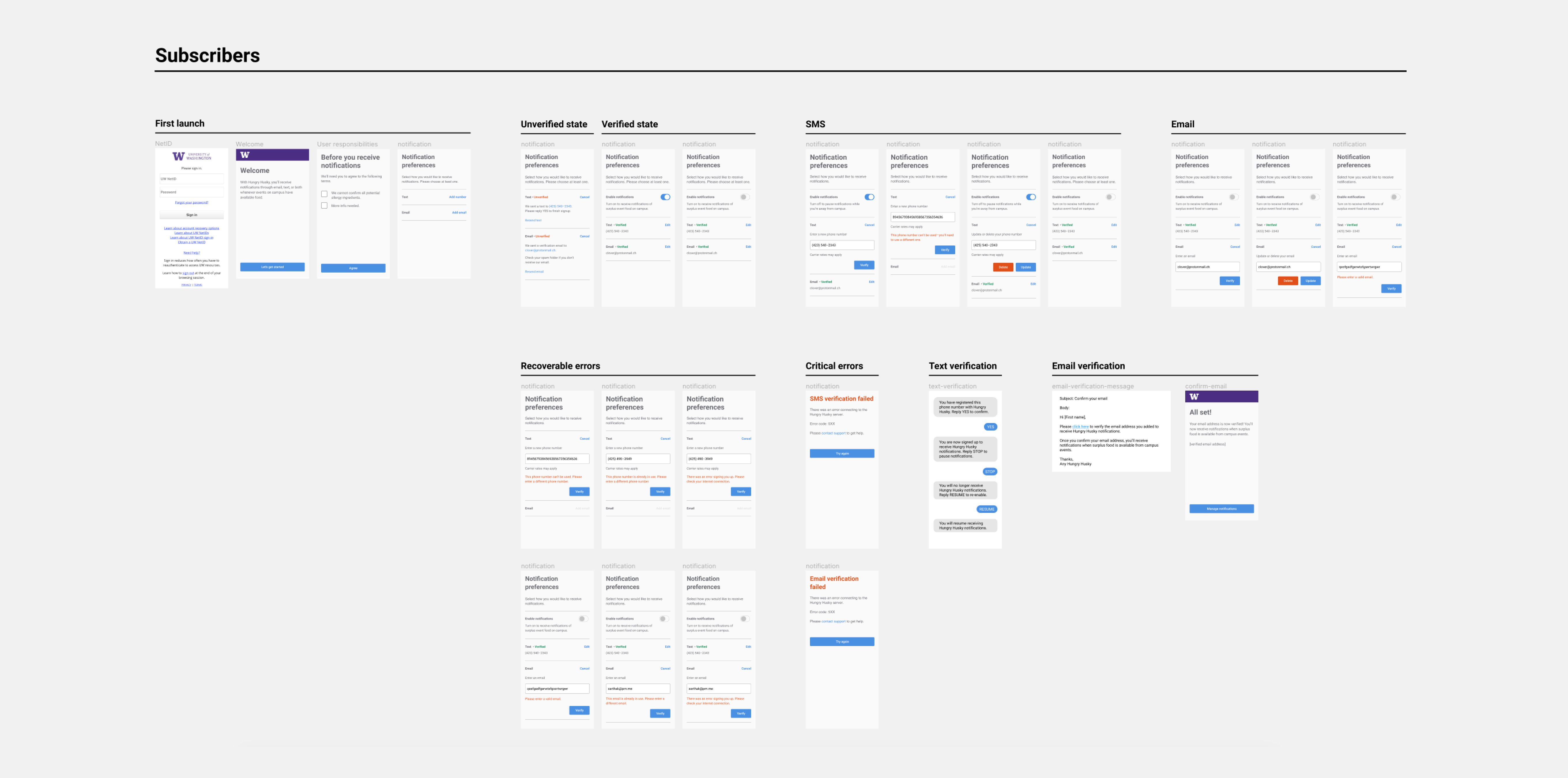
High fidelity designs
I implemented changes to address the findings from the usability study and then completed high-fidelity prototypes in Figma to prepare for development work. I started by creating a basic style guide which defined the typography, colors, spacing, and controls that would be used throughout the interface.
After completing the style guide, I designed the page views for the interfaces that hosts and subscribers would use. I made sure to be exhaustive in creating page views for a variety of states the system could be in (e.g., form validation messages, error states, interactive controls which change interface components).
Front-end development
Working with two developers, I helped to build out the front-end of the website with Vue.js. You can check out our GitHub repository here.

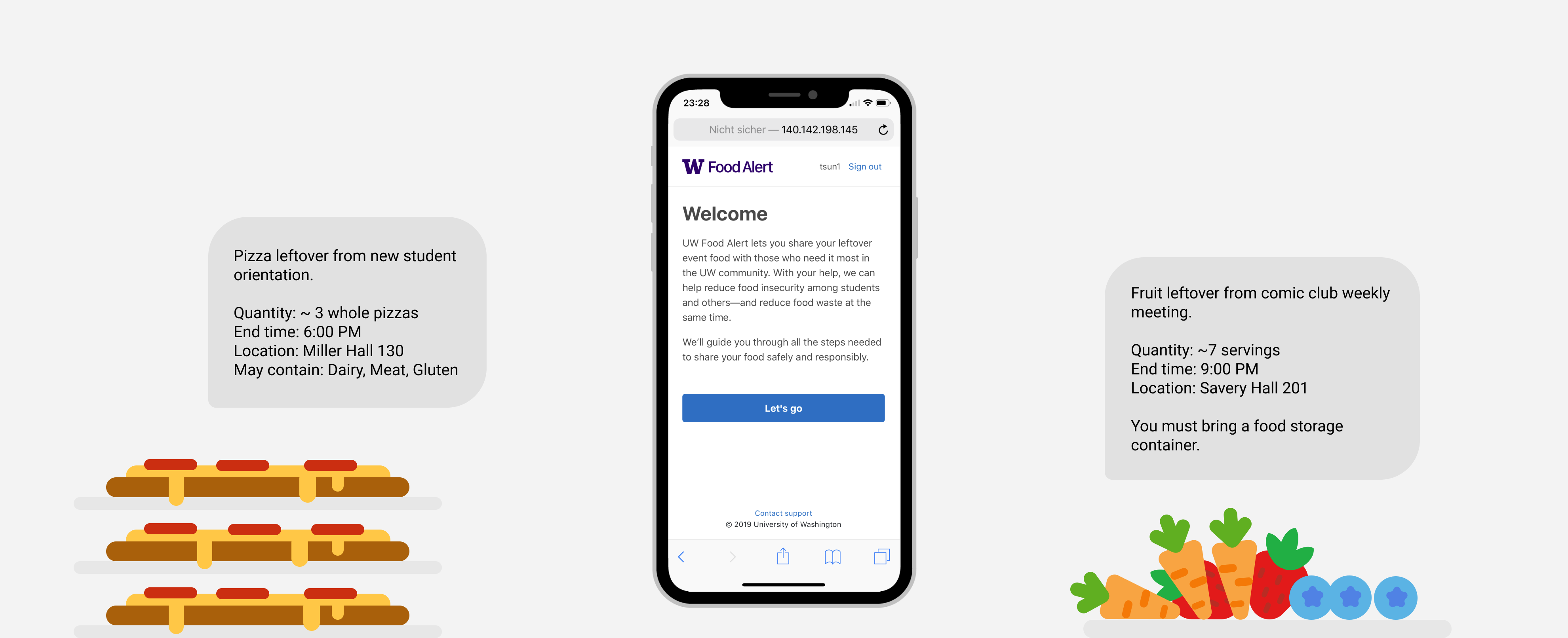
Mobile view
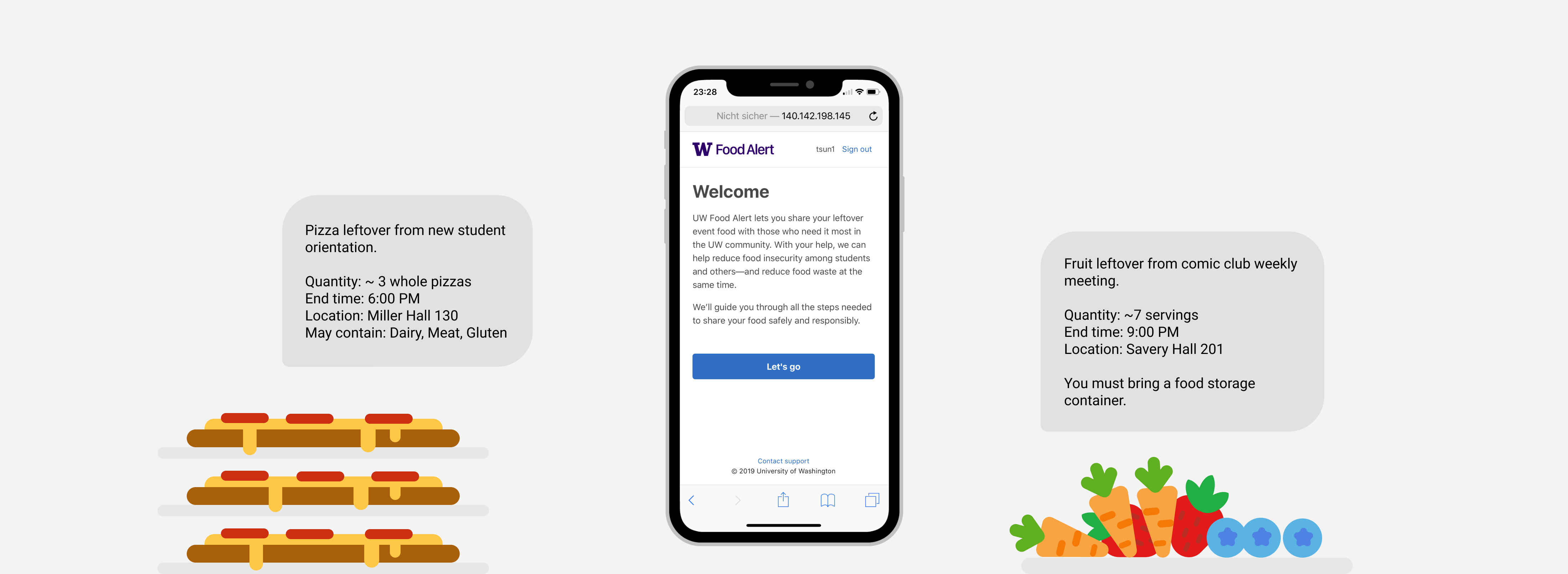
Desktop view
Team
- CLIENT
- Office of the Vice President for Student Life
- ENGINEERING LEAD
- Craig Stimmel
- FULL-STACK DEVELOPERS
- Aditya Kumar, Keith Roberts, Erin Rochfort, Sarthak Singh
- PROJECT MANAGER
- Lauren Manes
- UX DESIGNER & FRONT-END DEVELOPER
- Timothy Sun