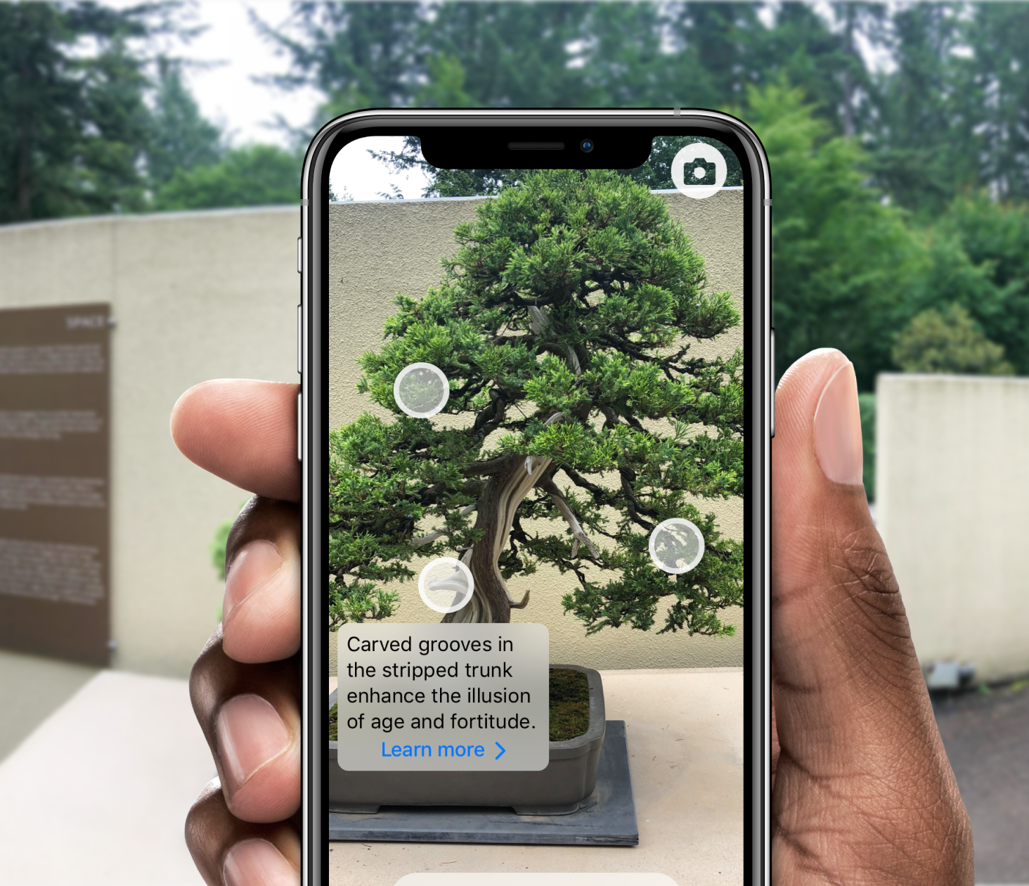
AR Bonsai
10 weeks, 2019
- AR user interfaces
- Interaction design
- Mobile app design
Together with four designers and the Pacific Bonsai Museum, I designed an AR experience for visitors to explore bonsai from new perspectives.
What's the opportunity?
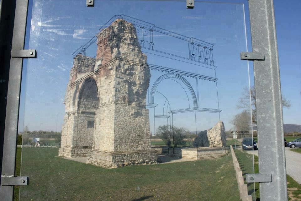
To celebrate its 30th anniversary, the Pacific Bonsai Museum wanted to provide visitors a new way to understand, appreciate, and connect with the living art of bonsai.
Our team researched, designed, prototyped, evaluated, and started development of an augmented reality application that provides visitors a rich and novel way to interact with and learn about bonsai while at the museum.
Investigative research
We started our process with investigative research to build an understanding of our problem space and stakeholders. We conducted a tripartite research study involving qualitative and quantitative research methods—field observations, interviews, and a survey.
Research findings
- The museum invokes peacefulness amongst visitors
- Museum visitors generally prefer a visual learning style
- Museum environment and exhibition setup affect visitor experience
- Visitors widely use smartphones to take photos
- Museum content lacks context and cohesion

Research goals
- Understand how visitors currently engage with the bonsai trees
- Museum visitors generally prefer a visual learning style
- Understand where visitor engagement could be improved
- Understand requirements of an engaging tool for Pacific Bonsai Museum visitors
Research questions
- How do visitors currently engage with bonsai trees in the museum?
- How would visitors want to engage with bonsai trees in the museum?
- What information would allow visitors to understand the bonsai trees’ history?
Field observations
To understand how museum visitors moved through and interacted with the bonsai collection and museum space, each team member completed two 30 minute observational studies at the bonsai museum. Each observer took field notes which were further analyzed after the observations.
We were interested in:
- How visitors interacted with the bonsai trees
- What emotions visitors expressed while interacting with the bonsai trees
- How visitors interacted with others while viewing the bonsai trees
- How visitors used technology while interacting with the Bonsai trees
- How visitors moved through the museum space
Interviews
To learn about the Pacific Bonsai Museum’s intentions and motivations for wanting a new system for visitors to learn about and interact with bonsai, we conducted two informal interviews with the museum Communications Director, Curator, Assistant Curator, as well as a museum volunteer.
These interviews covered how bonsai are an art form, how bonsai can be viewed within a larger context, what the museum is interested in seeing in a solution, and what experiences and resources the museum currently offers visitors. The interview was unstructured and we asked questions based on the flow and direction of the conversation. A team member utilized a smartphone to record the information so we can refer back to the information. A team member was assigned to take notes during the interview.
Survey
To elaborate, confirm, explore, and extend findings from the previous research activities, we created a survey to reach a larger number of our users. We wanted to learn about visitor’s use of technology, emotions experienced while visiting the museum, the kinds of information visitors were interested in learning, preferred learning styles (since the intent was to create an educational solution, we felt it would be good to see what learning styles visitors preferred), as well as general demographics. We received 42 responses, 38 of which were usable for our purposes.
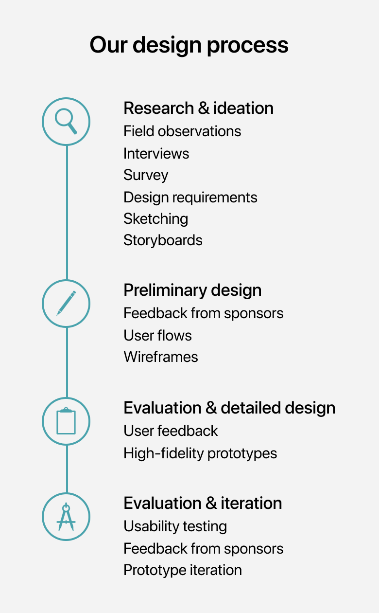
Ideation
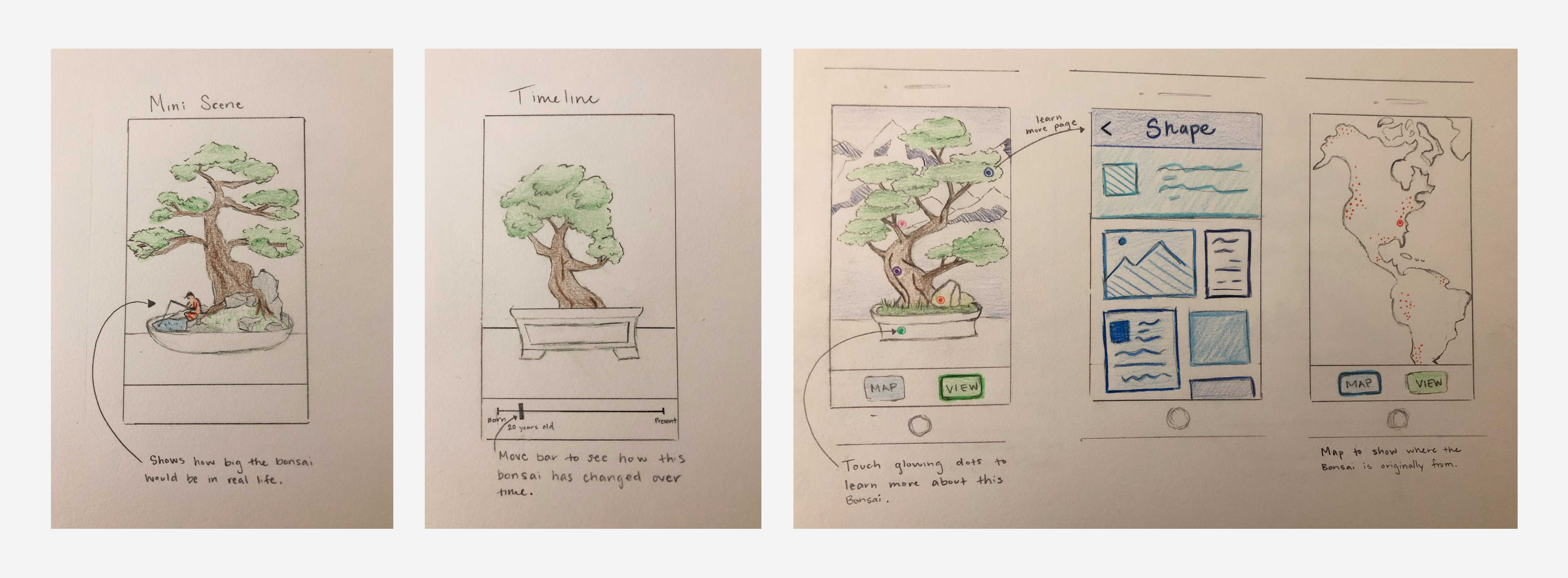
After researching the space, we individually ideated solutions by sketching and drawing storyboards. Based on requirements we had extrapolated from our research, we narrowed down 40 ideas to the three most promising.
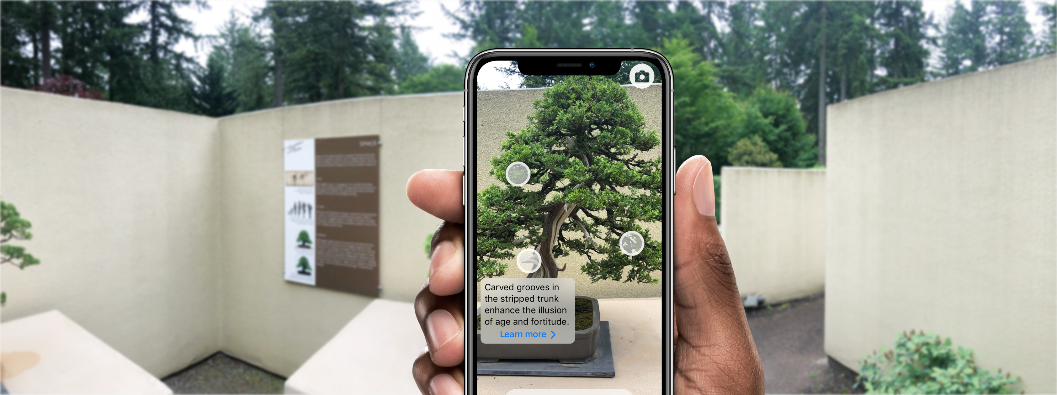
We were very interested in using augmented reality as a way to engage visitors with the museum exhibition. AR affords a way to present information over a real world scene and so we began exploring ways to present content digitally over an actual bonsai tree.
Sponsor feedback
We met with the Museum’s curator, assistant curator, and communications manager to present our research findings and initial design sketches. Through the discussions, we collected feedback and concerns which we factored into deciding what ideas to move forward with and what changes needed to be made.

User flows
After considering feedback from museum staff and visitors, we decided to pursue designing an AR app. We began by creating a user flow to map out each step a user would take to complete their goal of learning about bonsai in our app.
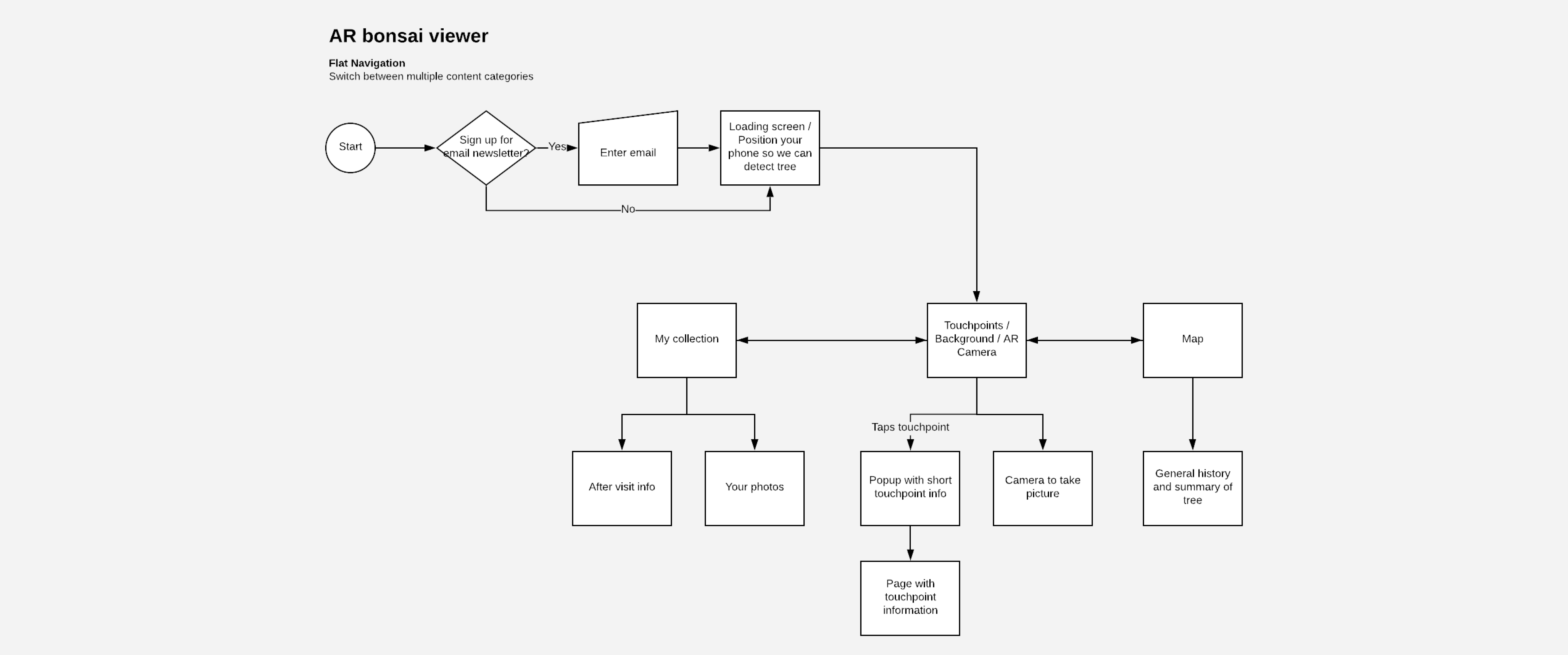
Wireframes
With an understanding of our system hierarchy and architecture, we created wireframes to design the app layout, prioritize and allocate space for content, and determine specific functionality across the system.
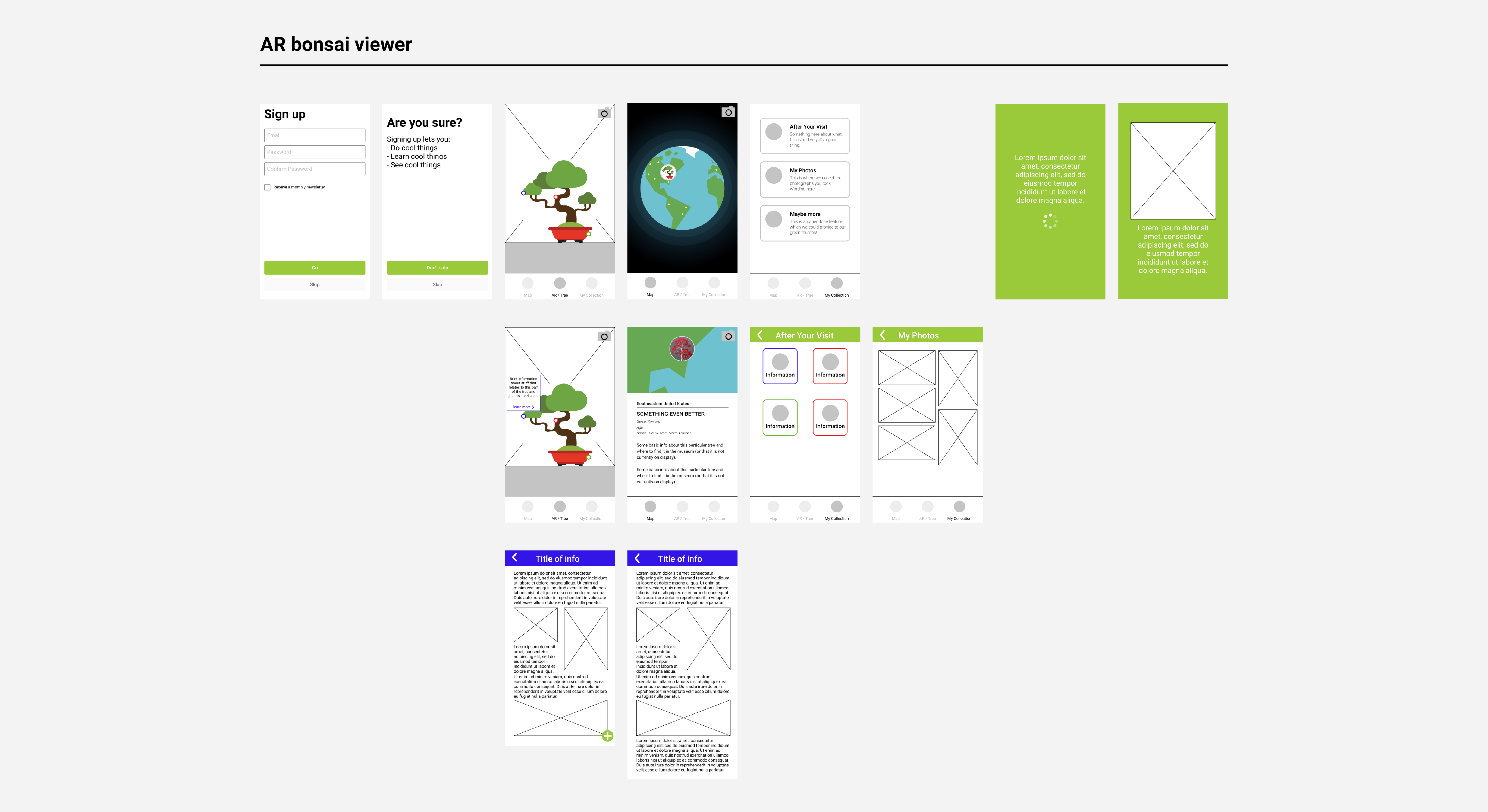
High fidelity mockups
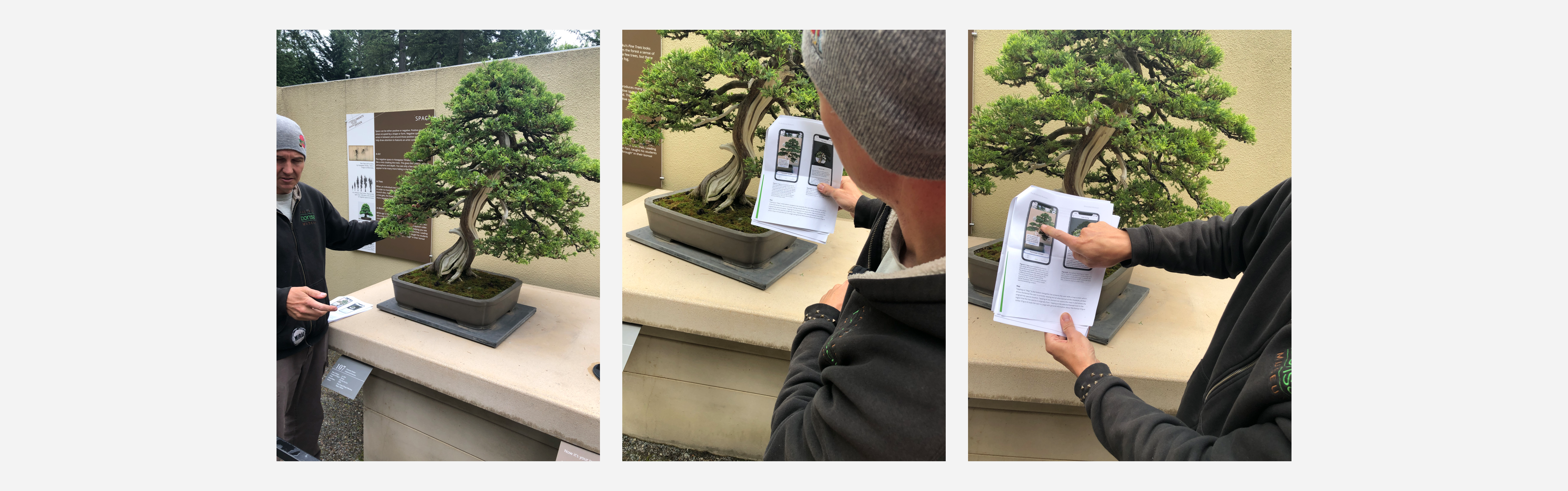
We presented our wireframes to museum visitors for feedback and input—we then created high fidelity prototypes to see our app fully fleshed out with content.
While we created our wireframes in Figma, we chose to use Sketch for our high fidelity prototypes to take advantage of plug-ins and UI assets.

Usability testing
To evaluate the effectiveness and understandability of our app, we conducted usability tests with five users. We asked participants to freely explore the app to gauge their initial impressions and then we had them complete three key tasks.
Key findings
- Inconsistency in navigational elements. Participants expressed confusion over how to get back to certain areas of the app. This is in part because the tab bar on the main screen did not persist across the app. So the deeper a user got in the app, the harder it became to back out.
- Poor readability and contrast. Color and text size could better accommodate the large percent of our user base that are over 55. Two participants reported elements being difficult to see and exhibited squinting and slouching behavior in trying to view the prototype closer.
- Unclear map functionality. Two participants noted that the “Map” section was not very understandable. They thought it was a reference to their location at the museum instead of a display of bonsai countries of origin. The icon for “Map” is a compass, and although the connection to a map of some kind was made, the type of map was unclear.
- Lack of onboarding. Three participants expressed a desire for a quick overview to learn about key features of the application before they started to use it.
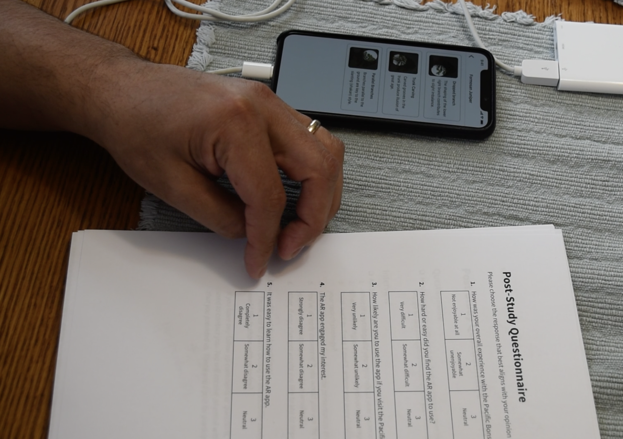
Overview
Using Sketch and the Sketch Mirror iOS app, our high fidelity prototypes were linked together to allow for interactivity between each of the pages, just as they would in the functioning application. Our usability testing consisted of four different components: pre-test survey, usability tasks, post-test questionnaire, and post-test interview.
Pre-test survey
The pre-test survey was designed to acquire basic demographic information about the participants. The survey was completed before the usability test session. Information about age, general interest in bonsai, technology use, and whether a participant had been to the museum was all collected.
Format
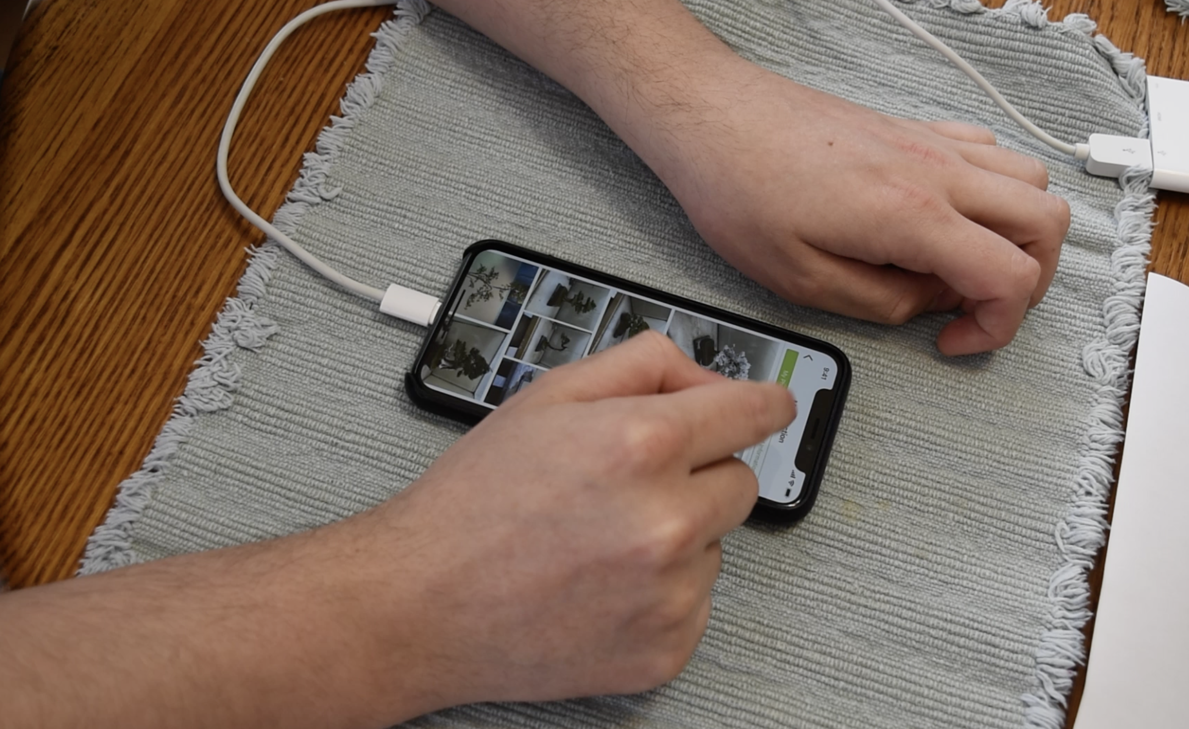
The usability tests were set up with one moderator who would guide the participant through the session; they introduced the study, conducted the session, and interviewed the participant afterward. There was also a notetaker who took notes on participant behavior and comments throughout the study. Furthermore, a camera was set up above the participant to capture video of interaction with the prototype as well as audio (with participant consent).
The usability test moderator opened the study by reading from a script (for the sake of consistency across all participants) detailing general information about the project, the participant’s role, and overall expectations. The moderator encouraged participants to vocalize their thoughts in accordance with the “think-aloud” protocol and asked if audio and video of the usability test could be recorded. Afterward, participants were presented with a consent form outlining the details of their participation and how their data would be used in the project.
Tasks
In our usability testing, we aimed to investigate three specific aspects of our design: namely, the touchpoints, map view, and the “My Collection” feature. Accordingly, we outlined three broad tasks which involved interaction with each of the these sections. The first task involved a participant exploring the AR touchpoints screen, tapping on a touchpoint, and being taken to additional information pages. The second task involved exploring the map feature, describing what the participant expected to find in the map feature, and finding additional information from the map section. The third task involved the exploration of the “My Collection” section. Participants were asked to navigate through and assess the “My Photos” and “Saved Information” pages.
Post-test
After participants had completed the tasks, we presented them with a five question survey asking about their satisfaction with their experiences using the system. Specifically, we wanted to learn about participant perception of ease-of-use, learnability, and future interest using the app. A few questions were based off of the System Usability Scale (SUS).
After participants had completed the post-test questionnaire, the moderator asked six open-ended questions to get a deeper understanding of participant experiences. Follow-up questions were asked when appropriate. Also, if the moderator noticed particularly low scores reported on the post-test questionnaire, they would prompt for additional clarification.
Sponsor feedback
In addition to usability testing, we presented the prototype to the museum curator for feedback and suggestions. On the whole, he was receptive but expressed a few concerns which aligned with our findings from the usability tests.
He also had a feature request for the app—a way to see historical images of the bonsai. This was important since over time, bonsai artists make changes to form and shape as the tree grows to alter or preserve an aesthetic.
Final iteration
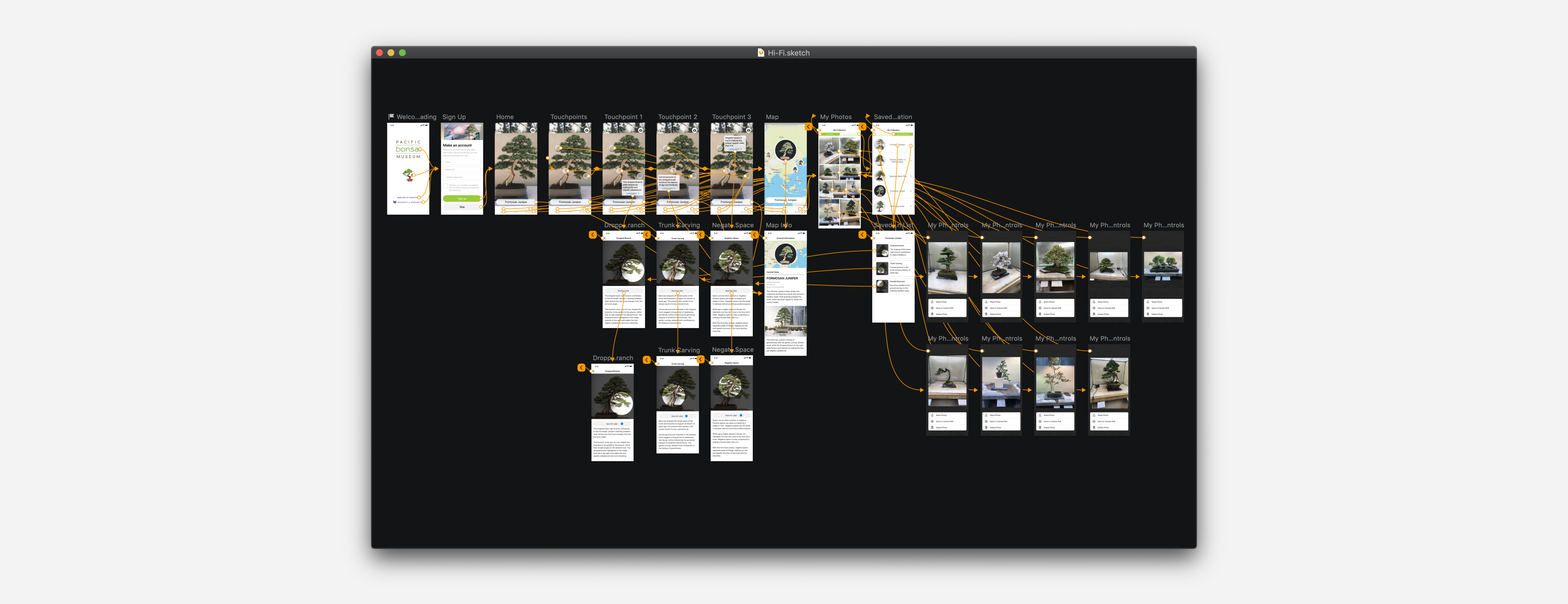
With the findings from our usability tests and feedback from the museum curator, we improved and further refined our high fidelity prototype. We decided to use Framer X for the final version of the prototype to take advantage of code components and richer animation abilities.
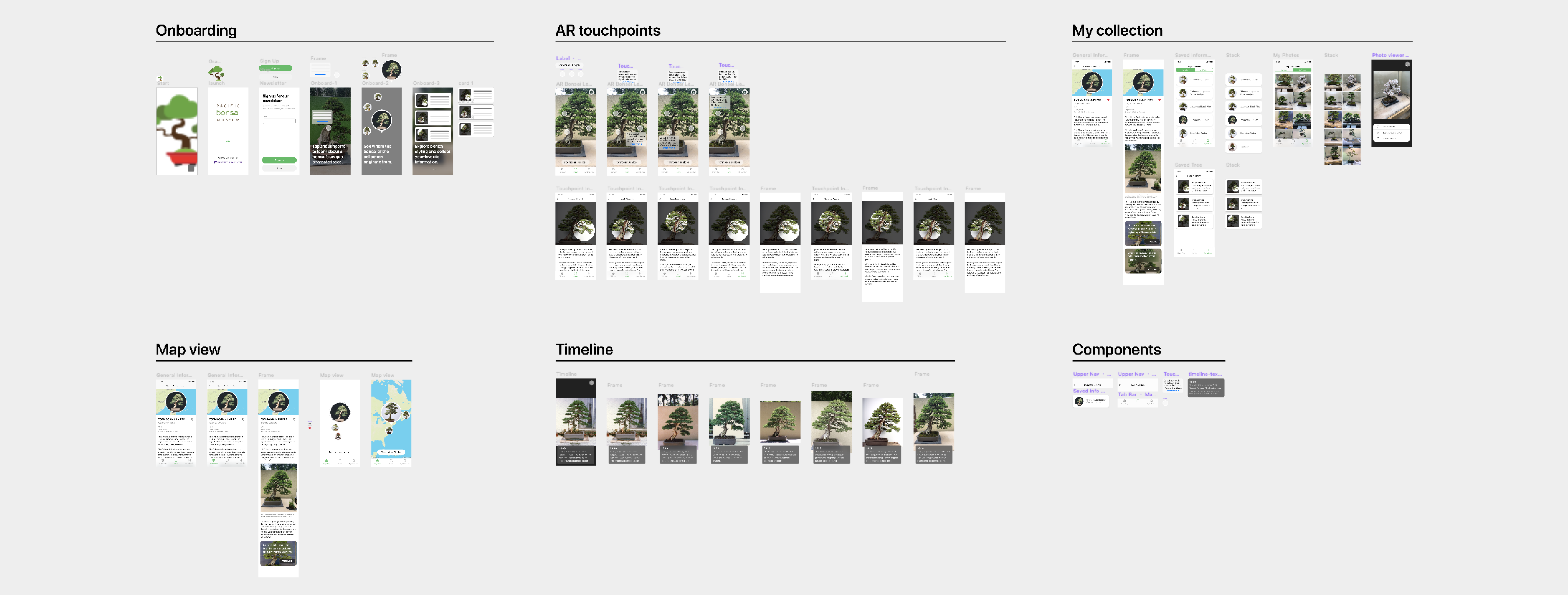
Onboarding
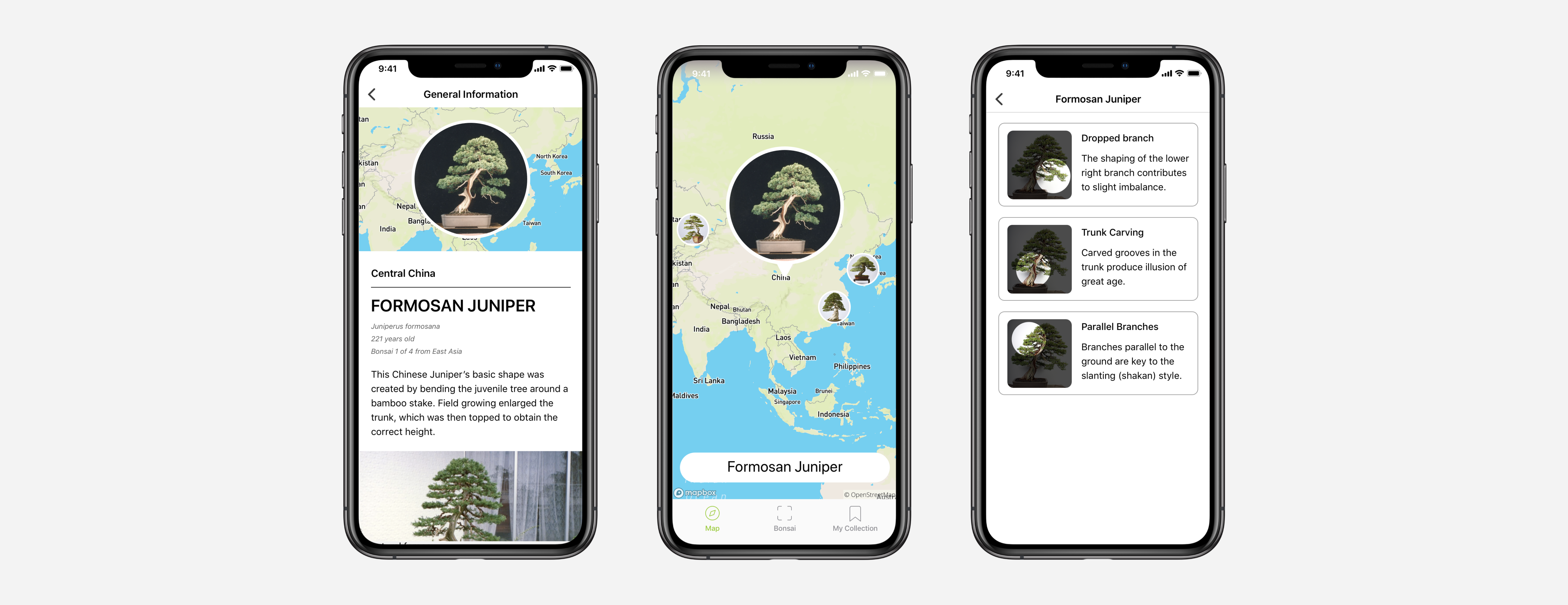
AR touchpoints
Map view, general info, timeline
My collection
Team
- CLIENT
- Pacific Bonsai Museum
- RESEARCHER & UX DESIGNER
- Laura Dickinson
- ILLUSTRATOR & UX DESIGNER
- Maria Perla
- DEVELOPER & UX DESIGNER
- Natalie Chow
- UI & UX DESIGNER
- Timothy Sun