Navindor
10 weeks, 2018
- User research
- Mobile app design
- Inclusive design
With a team of four designers, I designed an indoor wayfinding app to help the visually impaired navigate indoor environments more independently.
What's the problem?
Navigating unfamiliar indoor environments can be difficult for people with visual impairments. Guide dogs and canes are great for helping people detect objects in their immediate proximity, however they are less helpful when it comes to navigating between destinations indoors.
Our goal was to contribute a solution to help people with visual impairments navigate indoor environments with more autonomy and confidence.
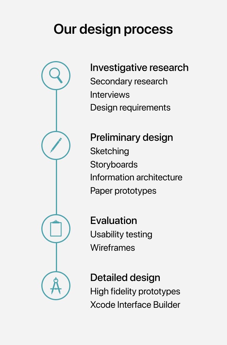
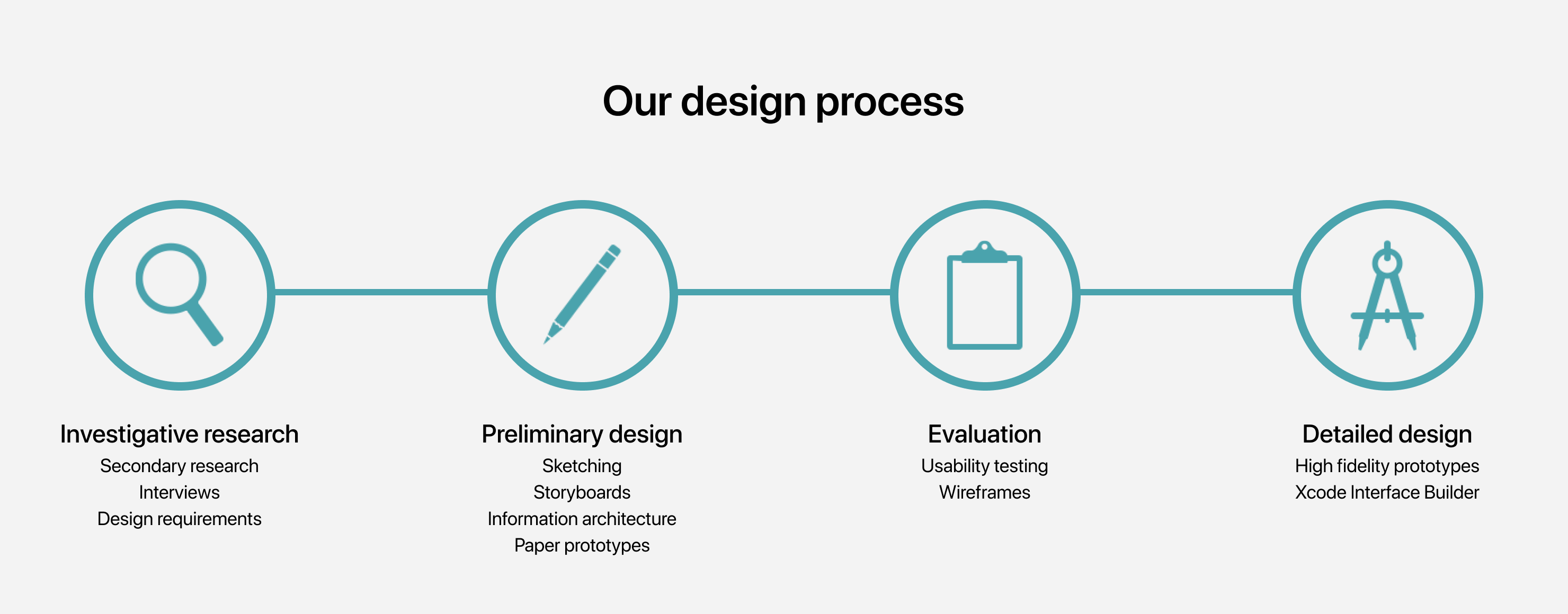
Investigative research
To understand and scope our problem space, we conducted extensive secondary research and semi-structured interviews with four people with varying degrees of visual impairment.
Key findings
Secondary research
Knowing very little about the problem space, we pored over blogs, articles, and videos created by visual impaired people to learn about how they reflected on their experiences. Additionally, we read academic ethnographies and disability studies literature to take on a more research-intensive mindset. The study in this research article is an example of work we leveraged in our research and design process.
Semi-structured interviews
We conducted semi-structured interviews with four people with different levels of visual impairment. We asked about their daily routines, navigational challenges, and habits. We transcribed our interviews and analyzed them with thematic analysis.
Personas
To externalize who we were designing for in shared artifacts, we created two personas with our research that we could reference throughout our design process.

Miranda Walker
Goals
- Wants to know what’s around her, an awareness of surroundings
- Wants to identify specific indoor locations
Painpoints
- Running into unexpected things
- Hard to navigate without accessible information (e.g. talking stop lights, labelled doors)
- Unnecessary help from sighted people without permission

Greg Wernicke
Goals
- Wants to explore new places
- Shorten the preparation time in the process of navigating
- Wants to know blind-friendly places
Painpoints
- Preparation of navigation takes a lot of time and effort
- Feels stressful when navigating in unfamiliar places
- Changes to indoor arrangements that he is already familiar with
Journey map
We created a journey map for our Greg Wernicke persona. While we adhered to our user research, some assumptions were made about Greg's feelings due to time constraints. We focused on communicating specific auditory and tactile descriptions to provide a richer description.

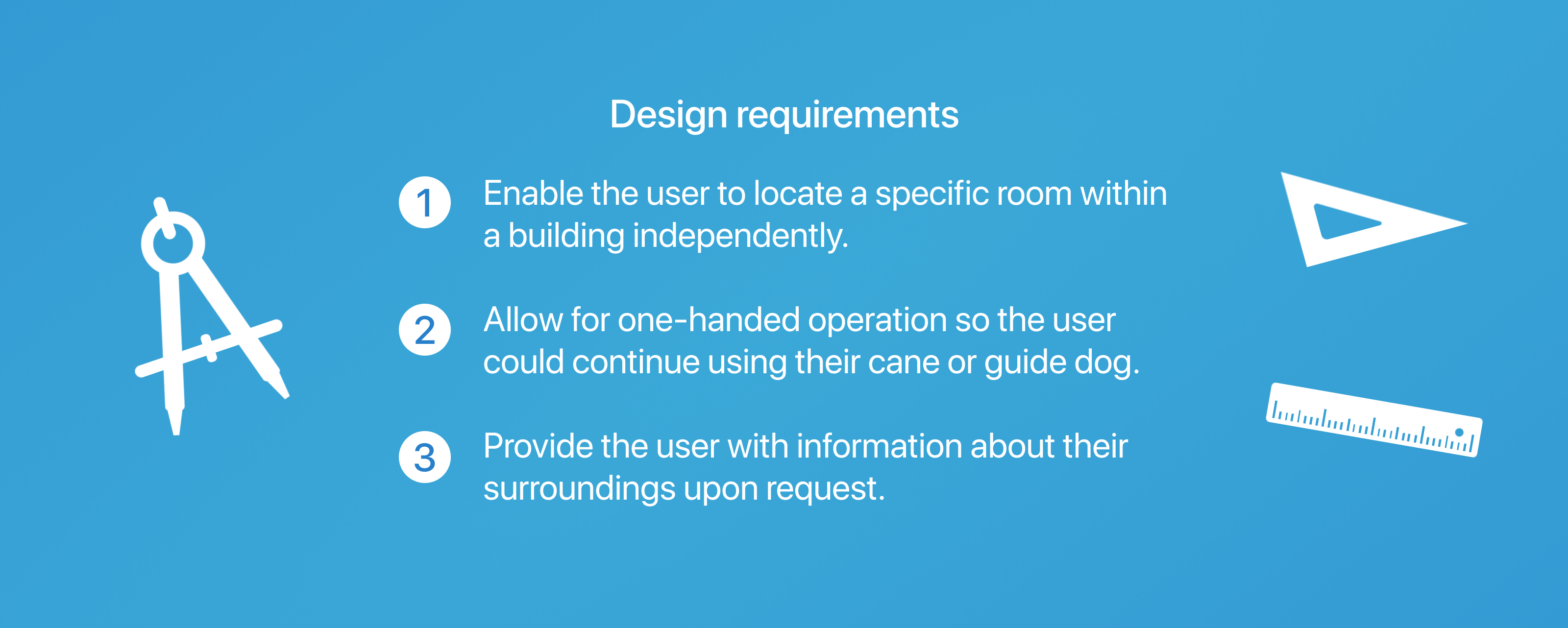
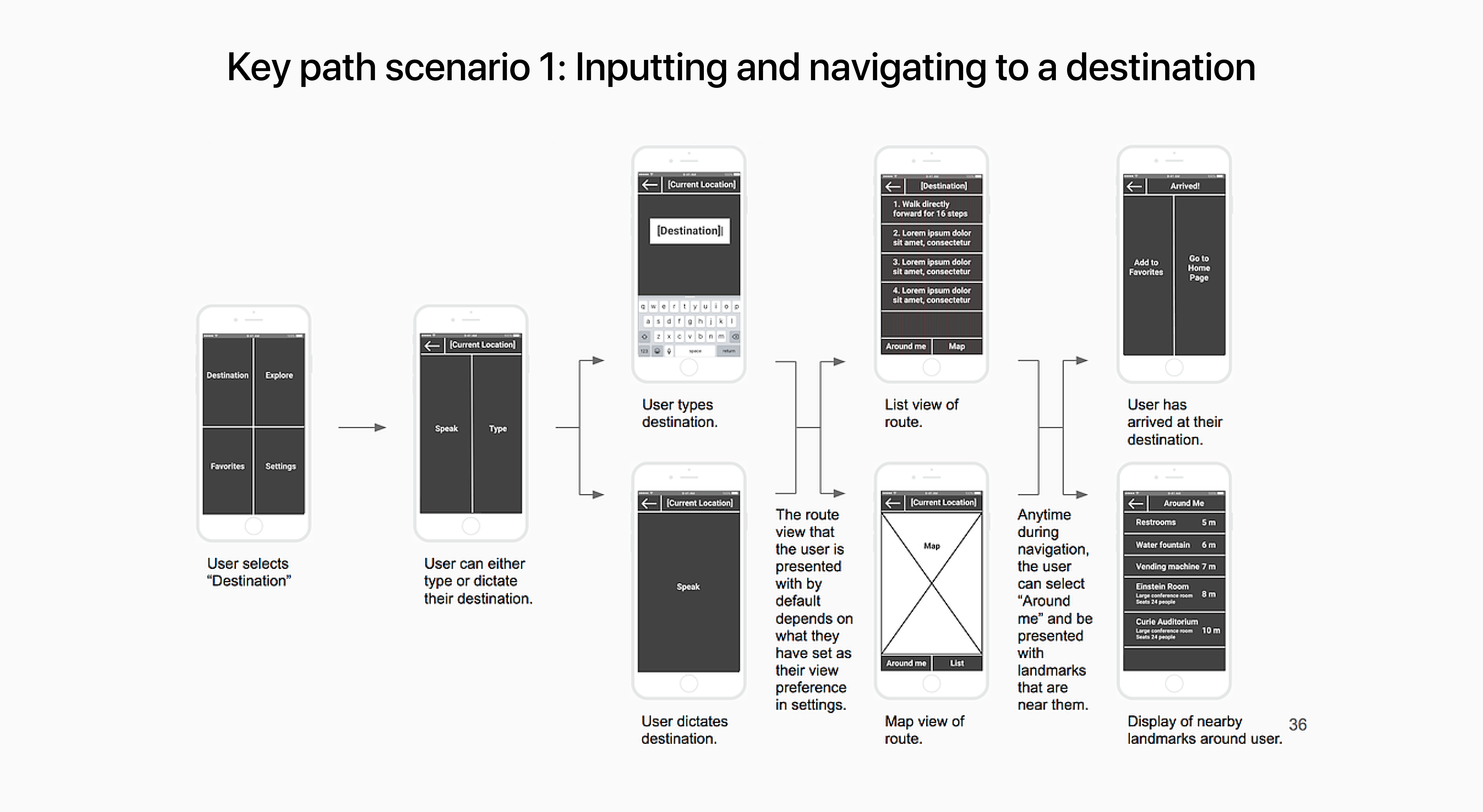
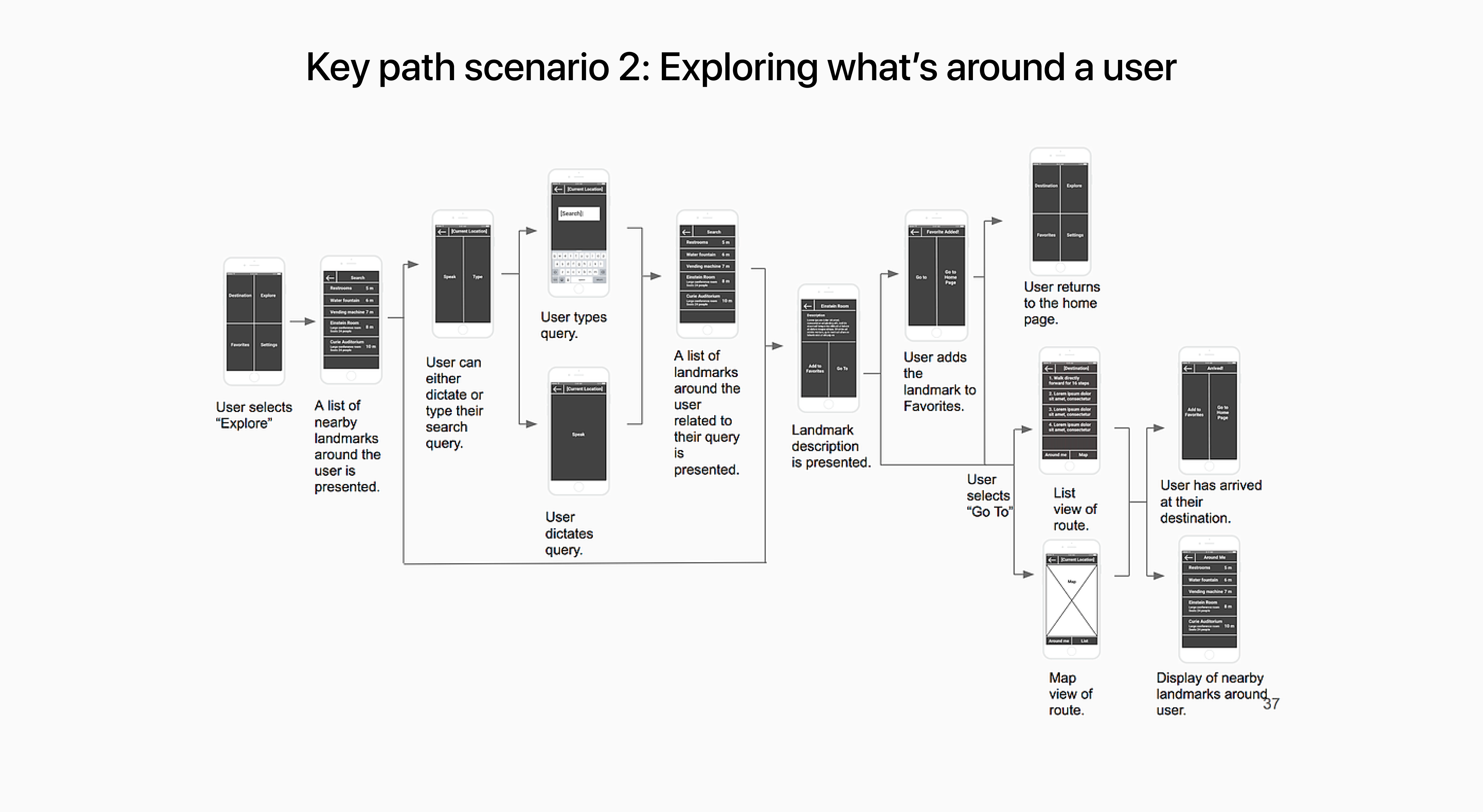
What can we design to contribute to indoor navigation and wayfinding?
With our problem scoped, we identified design requirements for our solution and began iterating design ideas.
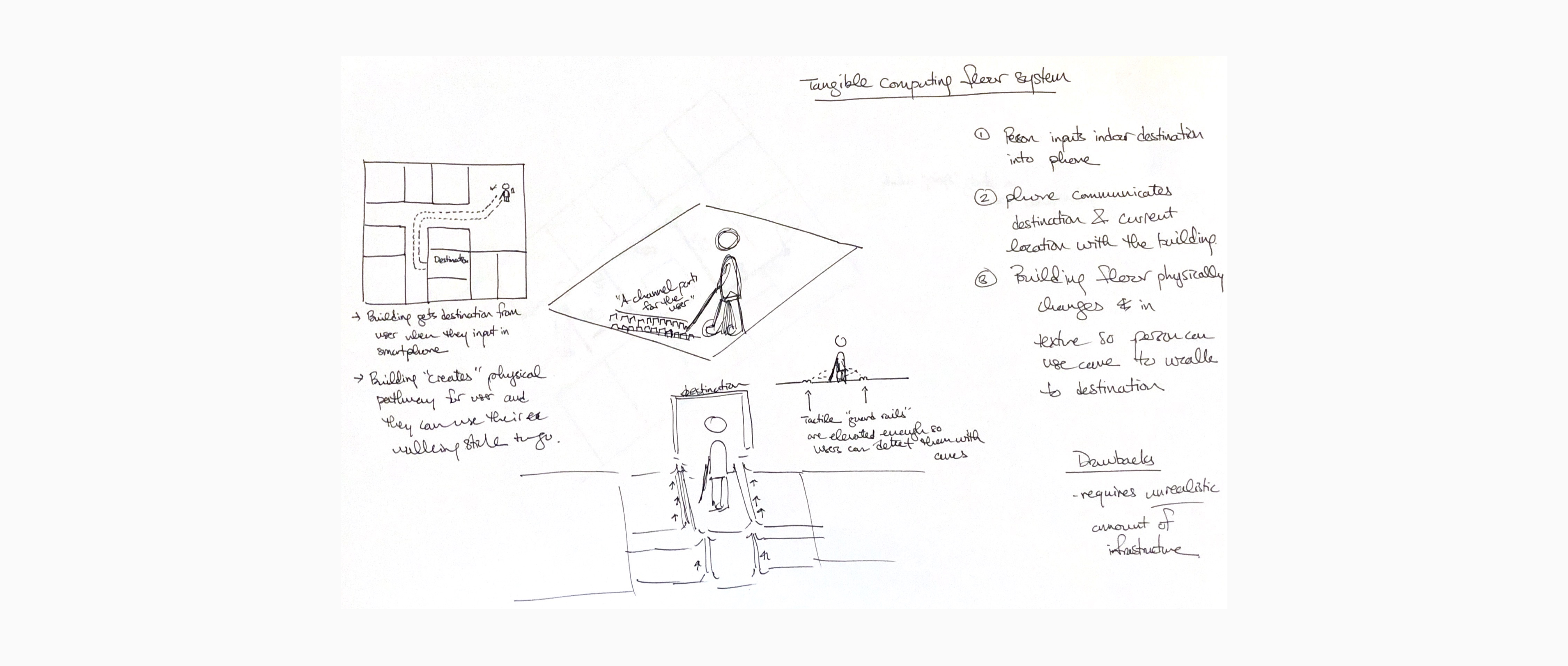
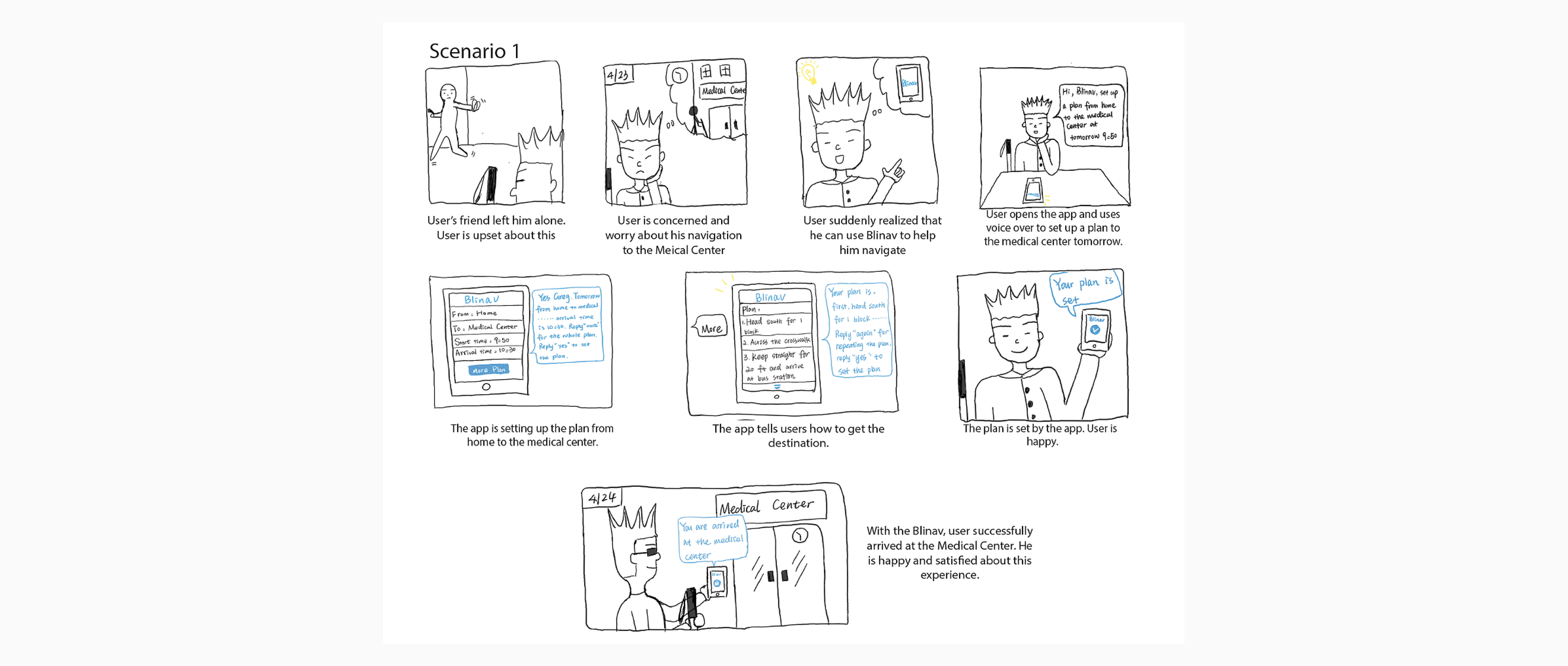
Sketching + Storyboards
With an understanding of our solution’s design requirements, we independently created sketches and storyboards to ground potential design solutions in specific contexts.

Information architecture
Sketches and storyboards allowed us to identify a direction and focus for our design solution. The information architecture drilled into the detailed functionality of our system. With an understanding of what we wanted to make, we outlined the hierarchy of information between each component which gave us the basis of our prototype.

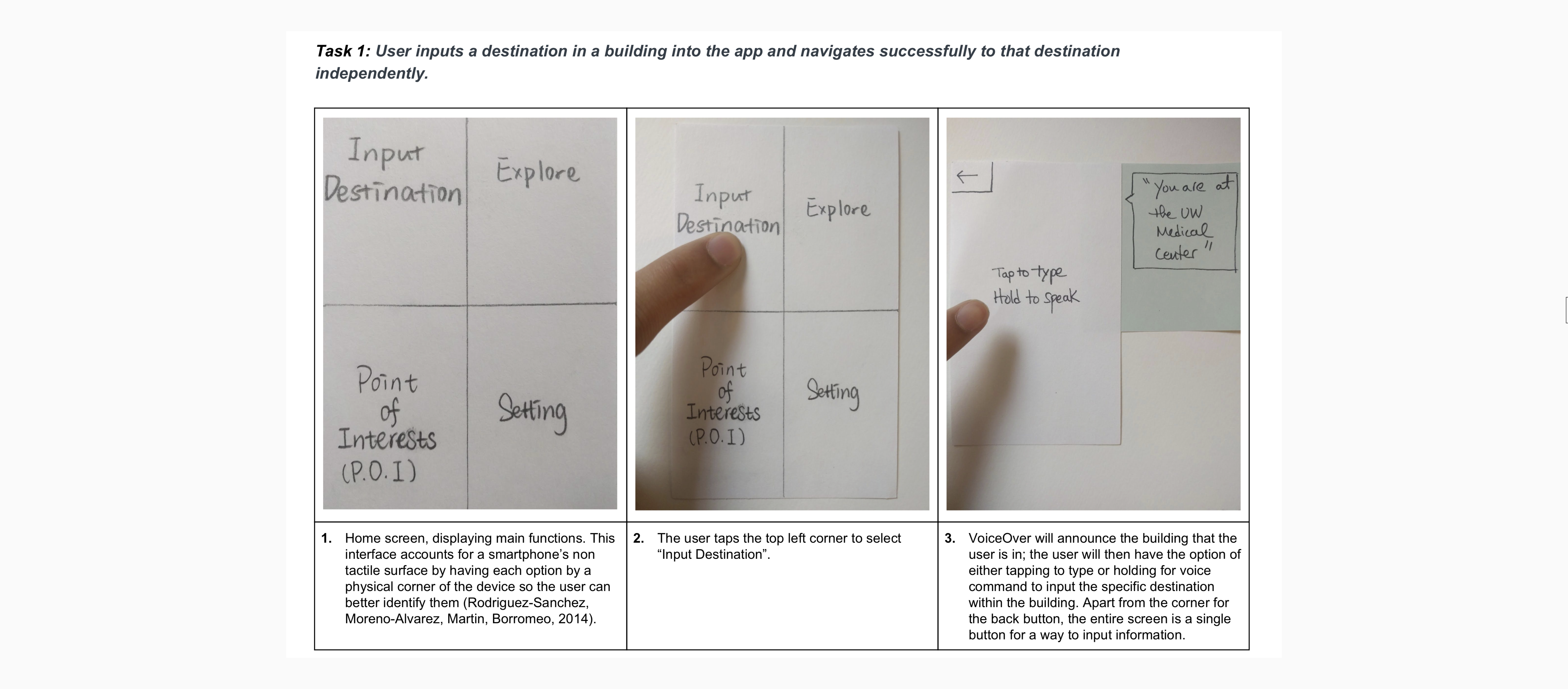
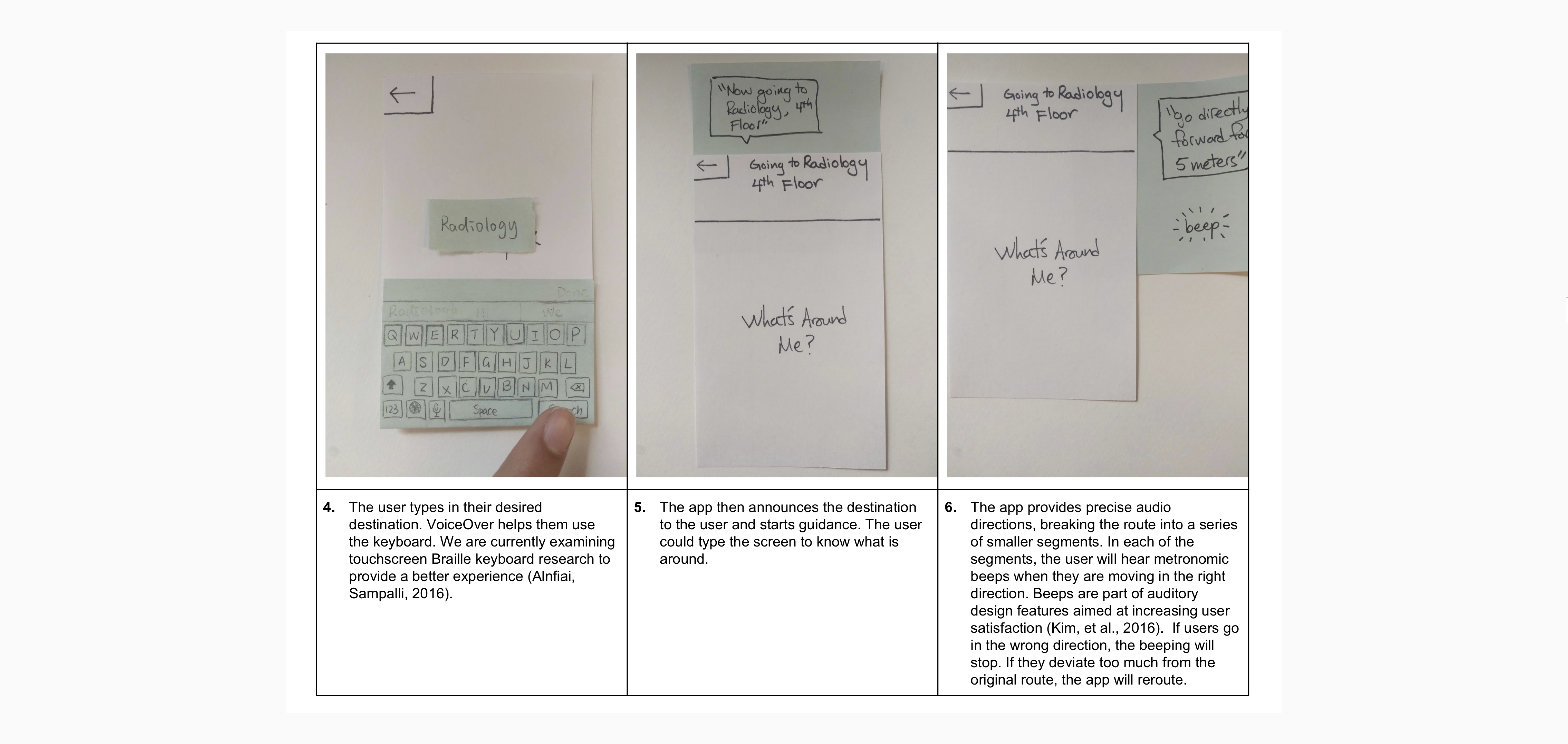
Paper prototypes
We created paper prototypes of our design to test the feasibility and usefulness of our concept. By starting with low fidelity, we could make changes rapidly while not growing too attached to our design.
Usability testing
To evaluate the usability of our paper prototype, we invited four users to complete three key tasks while blindfolded. This allowed us to identify usability issues. We implemented design changes based on the feedback from these evaluations into our wireframes.
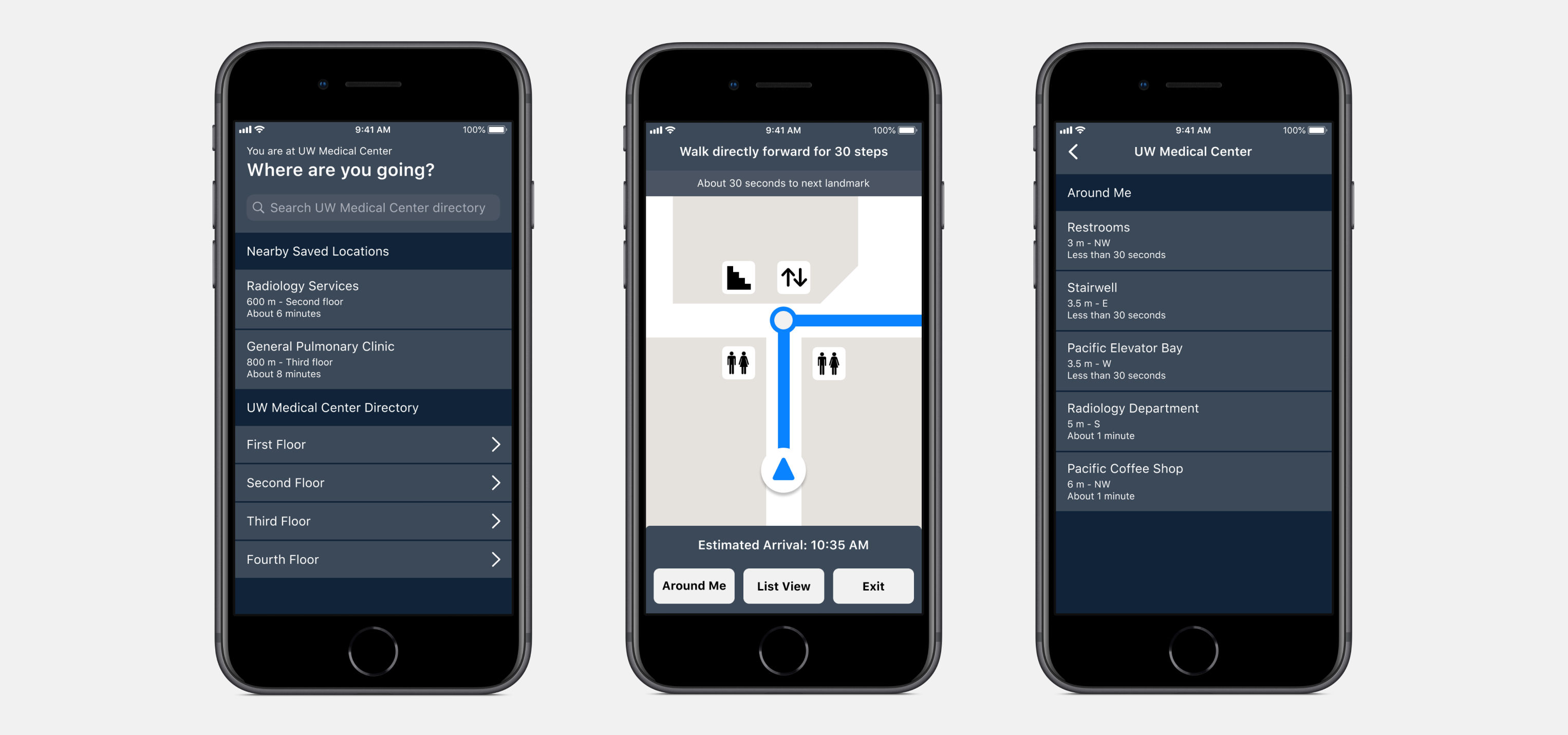
Finding 1: Users have difficulty interpreting the interface for functionality.
Our users had difficulty determining the buttons on each screen and therefore did not always understand each screen’s complete functionality. With certain interface designs, our participants experienced difficulty locating the right functions that would lead them to complete their tasks or subtasks without frustration or distress.
In our first evaluation, P1 had difficulty locating the “explore” button on the homepage. They kept tapping buttons other than “explore” and spent more than 3 minutes to find the “explore” button. In this task, they said, "why it is always POIs" (they kept tappingon POIs) and when got to the right button, they exclaimed, "Finally, explore!" Additionally, in our second evaluation, P2 had difficulty finding the home button after completing the navigation task. Because the home button is at the top left corner of the page, she barely touched it and kept searching for more than 2 minutes for the home button on the arrival page.
Finding 2: Users think that the beeping function is helpful.
As our users cannot directly see the direction in which they are facing, we implemented a directional beeping noise will be made during the navigation process when the user isfacing the right direction. Users will only hear the metronomic beeping feedback while they are walking in the right direction of their destination or subdestination. If the user is going in the wrong direction, the beeping noise will stop. Audio voice instructions will then inform the user of which way to orient themselves in order to ensure that they are going on the right path. The beeping noise will continue then. All participants expressed a preference for using and relying on the beeping feedback. Hence, we will keep this function as it appears to enhance the experience of navigating to a specific indoor destination. In our third evaluation, P3 said that “The beeping thing is really good” and similarly in our fourth evaluation, P4 said, “The beeping helps me I guess walk in the right direction.” They found the directional beeping to be helpful and it enhanced their experience.
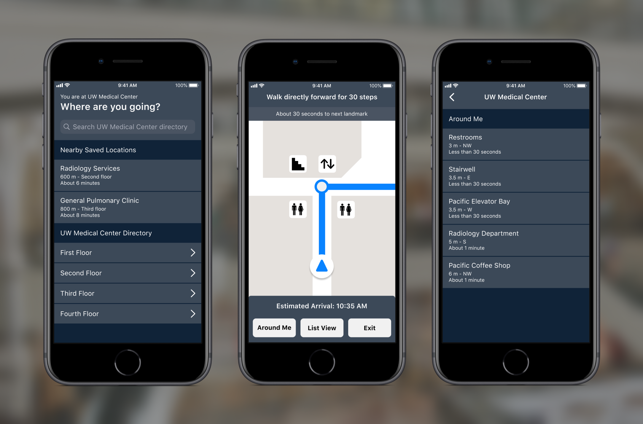
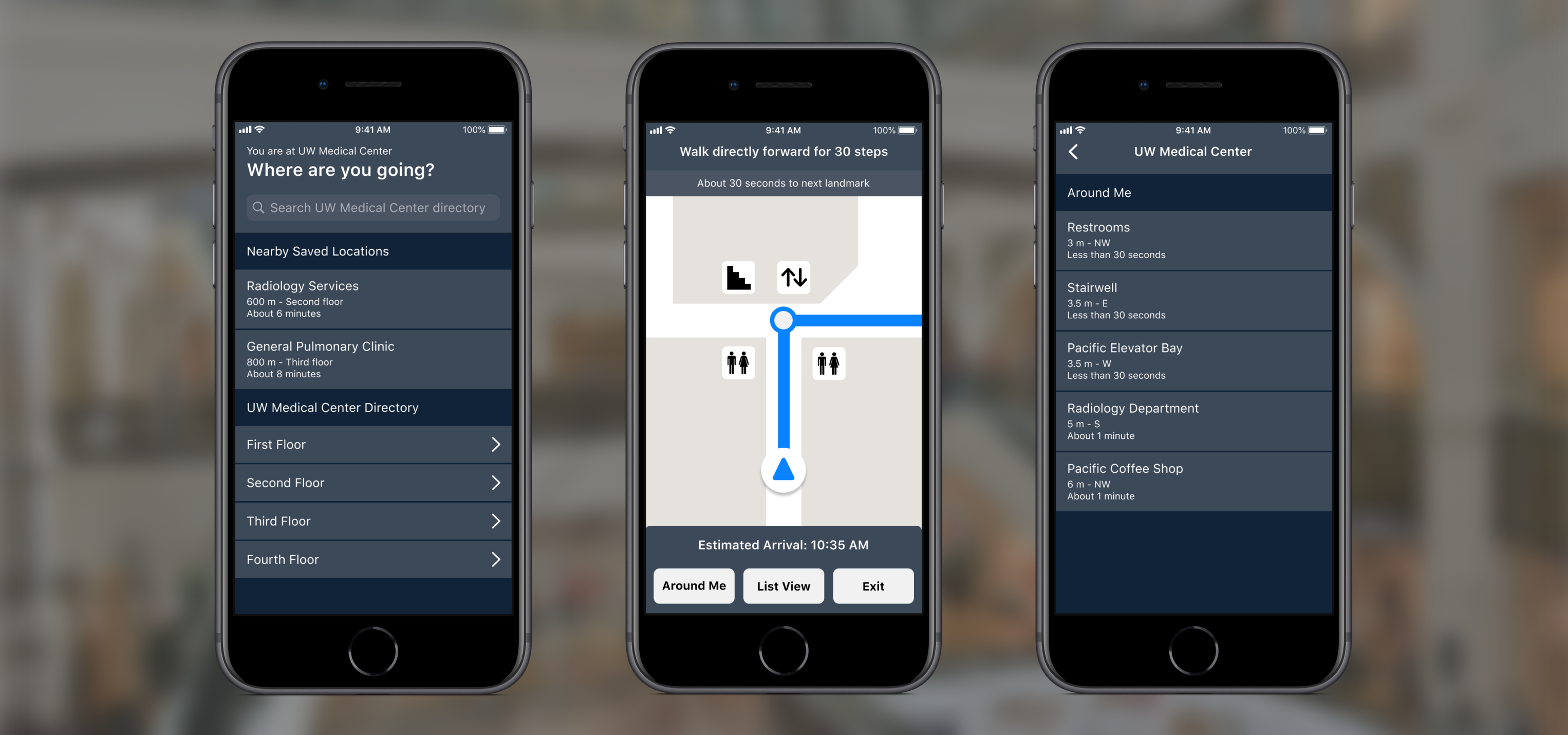
Finding 3: Presentation of POIs across multiple pages was cumbersome and frustrating to navigate through.
Our participants noted that navigating through the Points of Interest pages was slow and frustrating. The POIs were spread out across multiple pages with buttons to navigate to each page at the bottom of the screen. This is the only part of the app where buttons are on the bottom of the screen so participants did not readily tap around that area. In the third evaluation, P3 got a little frustrated when she was not able to find “UW Medical Center” on the first page—“UW Medical Center” was located on the second page. She then tried swiping the screen to get to the next page but did not succeed. It took her 3 minutes to go down to the page and figure out the need to tap the next button. In the last evaluation, P4 explicitly asked “why are the locations spread out over multiple screens?” when trying to find the “UW Medical Center” on the second page.
Finding 4: Distances presented only in meters are confusing to understand.
In the process of navigation, participants were told distances in meters between themselves and landmark points or turning points. However, our participants found it difficult and confusing to interpret distances in meters or feet. Specifically, they did not feel that the distances presented were very useful to their immediate navigation. P3 noted that “I can’t tell how far 50 meters is” and P4 asked, “How much are 5 meters?”. In our interview, they reflected that the distances themselves were fine but understanding how to use and measure those distances, especially while blindfolded, was much more difficult.
Finding 5: Button to input voice command was confusing.
In our evaluation, the participants were unsure of how to use the “hold to speak”function when searching for their destination within the UW Medical Center. As a result, our participants were confused on whether their commands would be processed immediately or if they needed to wait a certain period of time before voice command was activated. In our second evaluation, P2 did not know when to speak after holding the button. She held the button for 20 seconds but did not say anything. In our third evaluation, P3 had difficulty in understanding the “the tap to type/hold to speak” function. She explicitly asked what this function was and our facilitator had to explain it to her. She then understood how to use the function.

Consultation with an accessibility specialist
To get more specific feedback on the accessibility features of our design, we presented our paper prototype to Hadi Rangin, an accessibility specialist at the Accessible Technology Center and Do-IT at the University of Washington. Hadi is also visually impaired so his feedback was particularly beneficial for our purposes. We incorporated his feedback into our wireframes and in our final high fidelity mockups.
Wireframes
Based on the findings from our usability testing and our consultation with Hadi, we created wireframes to overview the layout, purpose, and functionality of each screen in our system. Design elements we explored were text sizes, text/background color contrasts, and other visual considerations for low-vision users.
High Fidelity Mockups
Critical to the success of our system was compatibility with screen readers like VoiceOver. When it came time to designing our high fidelity mockups, we used the Interface Builder of Xcode so we could simulate VoiceOver functionality.
Team
- RESEARCHER & UX DESIGNER
- Claire Guo, Augustina Liu, Sunny Mishra, Timothy Sun