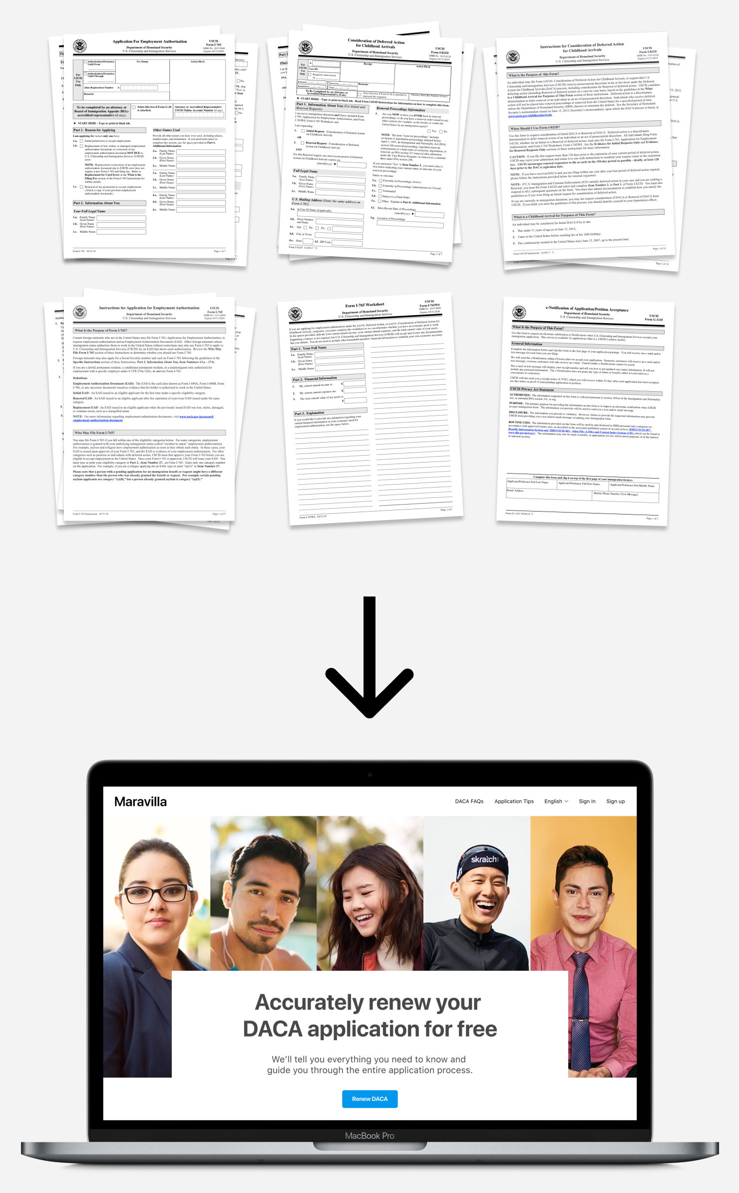
Maravilla
10 weeks, 2019
- Interaction design
- Web design
- Web development
Applying for DACA protection is stressful. Working with a designer, I streamlined the onerous process by consolidating information, defining requirements, and managing workflows.
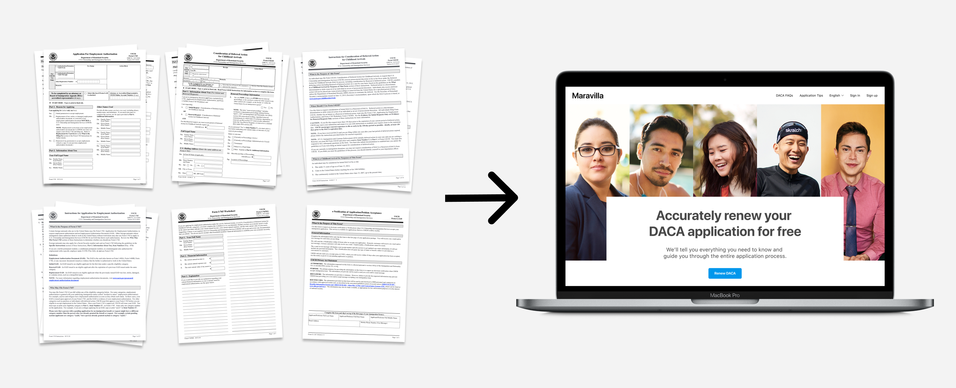
What's the problem?
Approximately 700,000 young undocumented immigrants in the United States are protected from deportation under the DACA program. The application process is highly stressful and complicated—involving the completion of multiple forms and the collection of specific documents to prove eligibility. Can we streamline the process to ease burden?


Investigative research
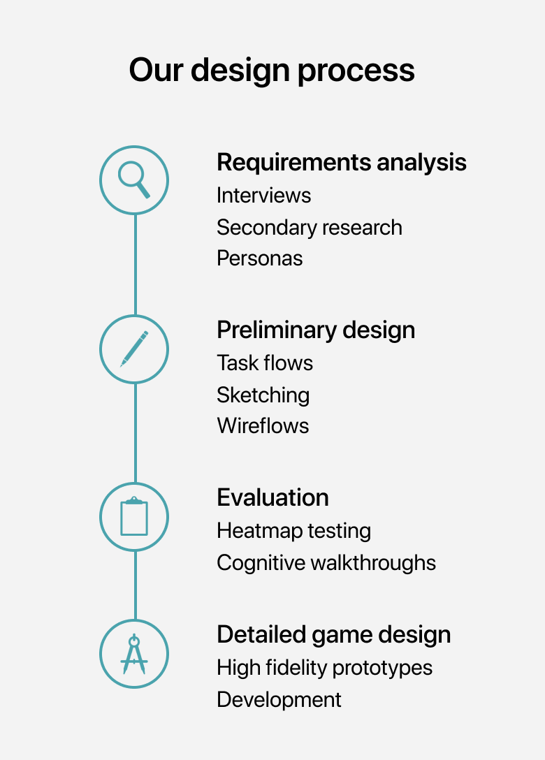
We needed to research two key elements of our problem space: first, the context and environments of our users and second, the DACA application process itself. Relevant solutions would exist at the intersection of deep user understanding and knowledge of the application process.
We interviewed a DACA recipient and an immigration attorney to understand painpoints and goals in the application process from different perspectives. We also conducted extensive secondary research, triangulating information and resources from the US government, immigration law firms, immigrations NGOs.
Interviews
We conducted one-on-one, semi-structured interviews with a DACA recipient as well as an immigration attorney experienced in helping clients with their DACA applications. We learned that:
- The process of gathering required documents to prove eligibility is a hardship, especially if the applicant has changed residences.
- Keeping track of all the required forms and documents can lead to confusion and “feeling lost.”
- If the same information is required across multiple forms, that information must be reported by the applicant in the exact same way (e.g., using the exact same residence address across multiple forms)
- According to the attorney, some applicants encounter form fields which they don’t understand and thus do not complete. This can result in an application being denied.
Secondary research
We discovered information and literature concerning DACA on the internet which we were able to utilize as part of our requirements analysis phase. We sampled from United States Citizenship and Immigration Services (USCIS), immigration organizations, law firms, as well as academic research efforts like this qualitative study which interviewed eight DACA recipients.

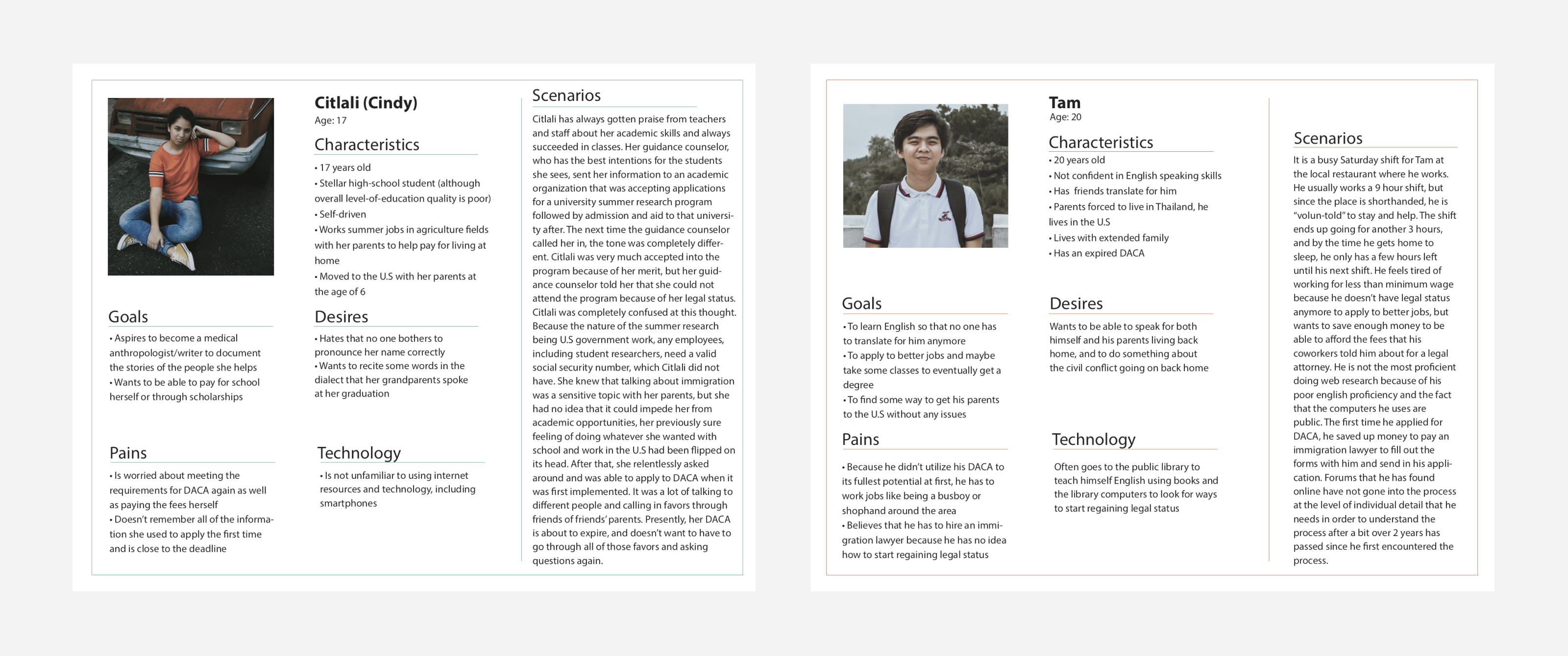
Personas
We synthesized our research findings into two personas to develop a shared understanding of our users. The personas guided us through ideation and evaluation futher down the line.
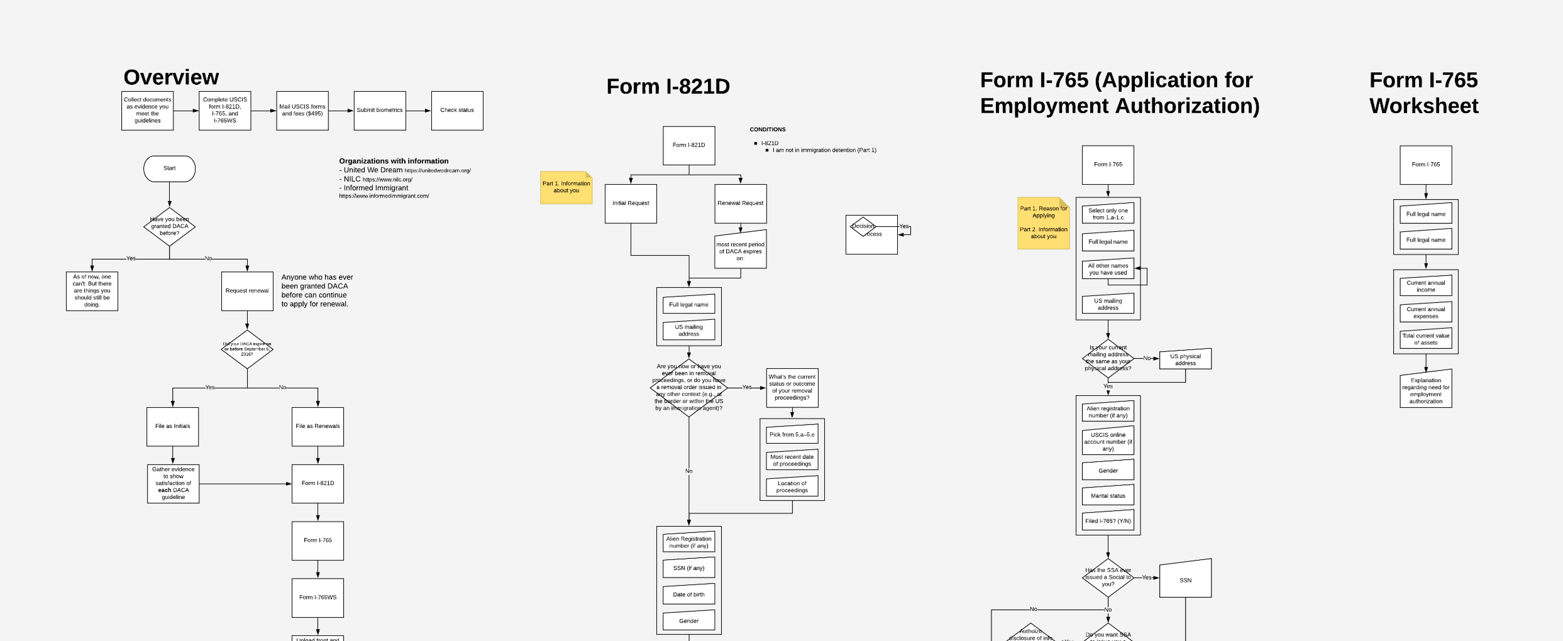
Process flows
I printed out the every single form and instruction packet required in the DACA application process and began creating an inventory of the information needs. This became the basis for the task flow that users would need to engage with.
Throughout this process, I realized that a lot of the same information was required across multiple forms. As such, I pulled out those requirements into their own section so the user would only need to fill things out once—thus reducing potential for mismatch errors.
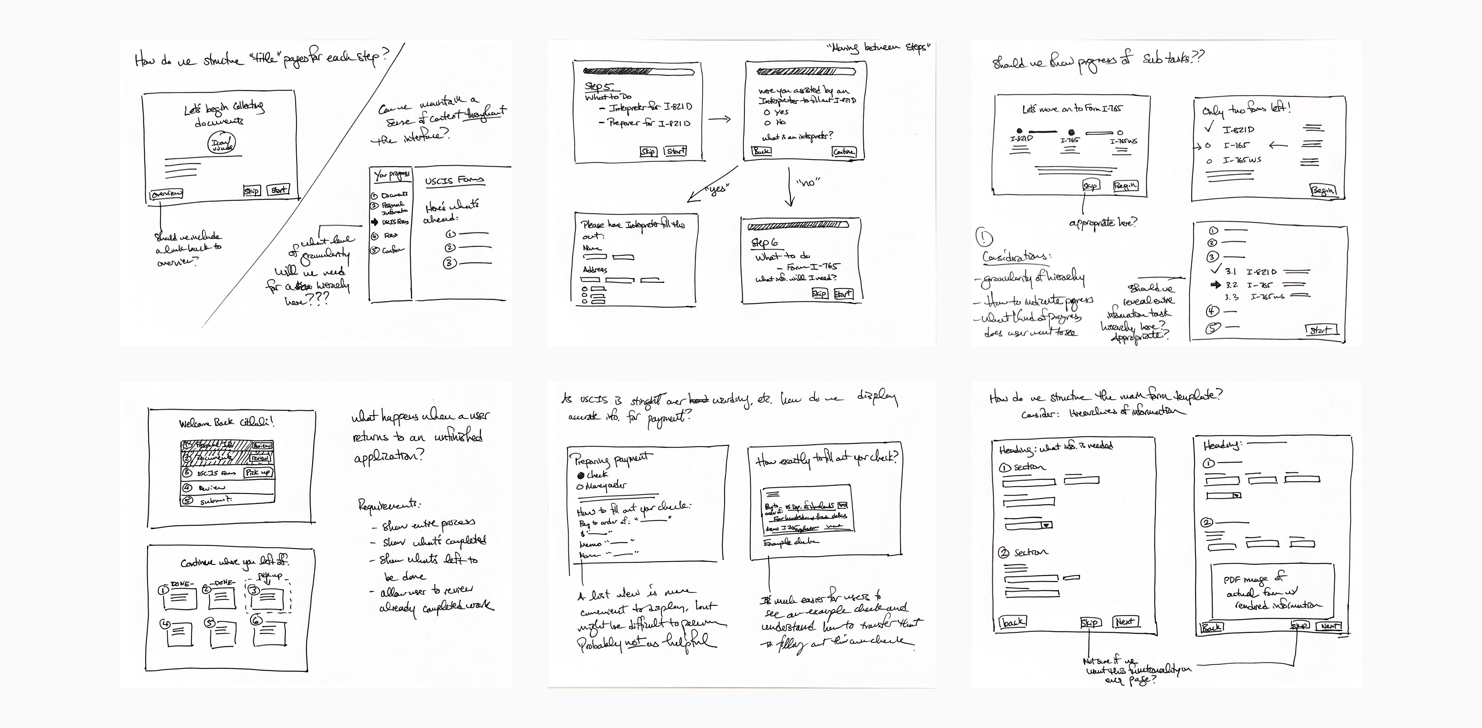
Sketching
To quickly iterate different design possibilities that reflected the process flows, we sketched a variety of interfaces to experiment on ways to accommodate our user and information needs. Using those sketches, we began creating prototypes at higher fidelities with Sketch and later, Figma.
Wireflows
To think through how users would traverse the site, we created wireflows—wireframes that have annotated transitional elements to think through how different pages would be linked and how larger tasks were separated out. This was important because we had to account for every step of the application, especially in a context of criticality which involves a person’s legal status.
Evaluation
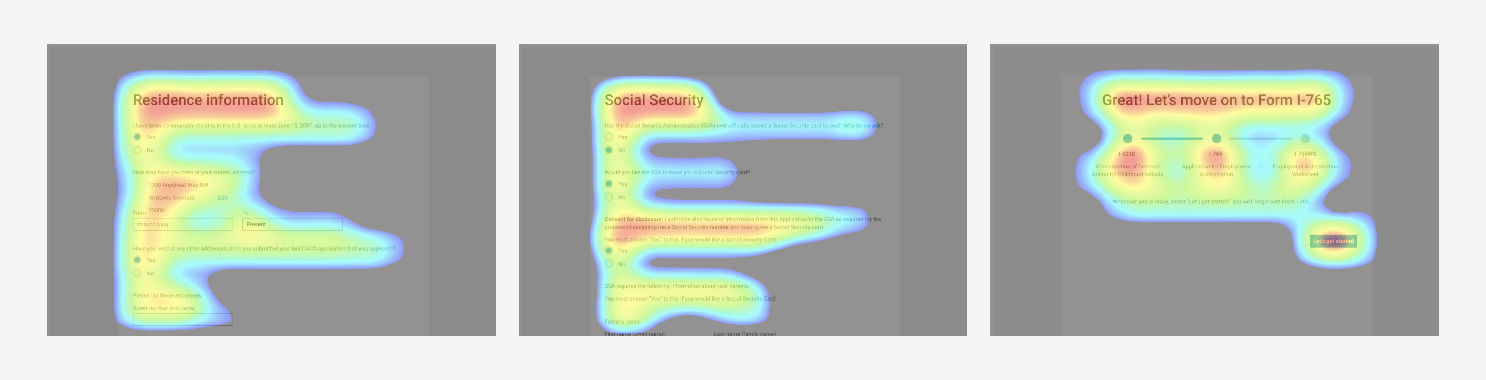
We conducted an eye-tracking study to see how users reacted to our interfaces and where they looked for information. We also conducted cognitive walkthroughs to evaluate how our site supported the completion of key tasks.
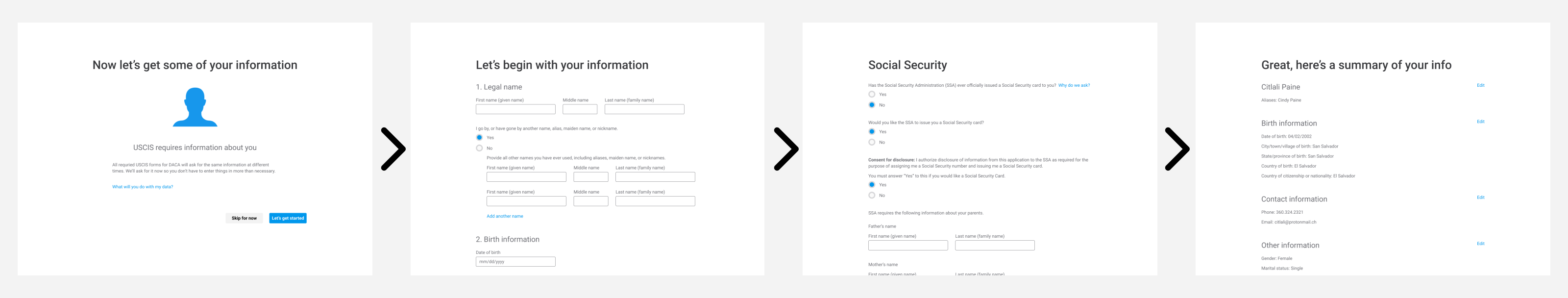
High fidelity mockups
After testing our interfaces for usability and effectiveness, we refined our designs and created mockups in high fidelity.


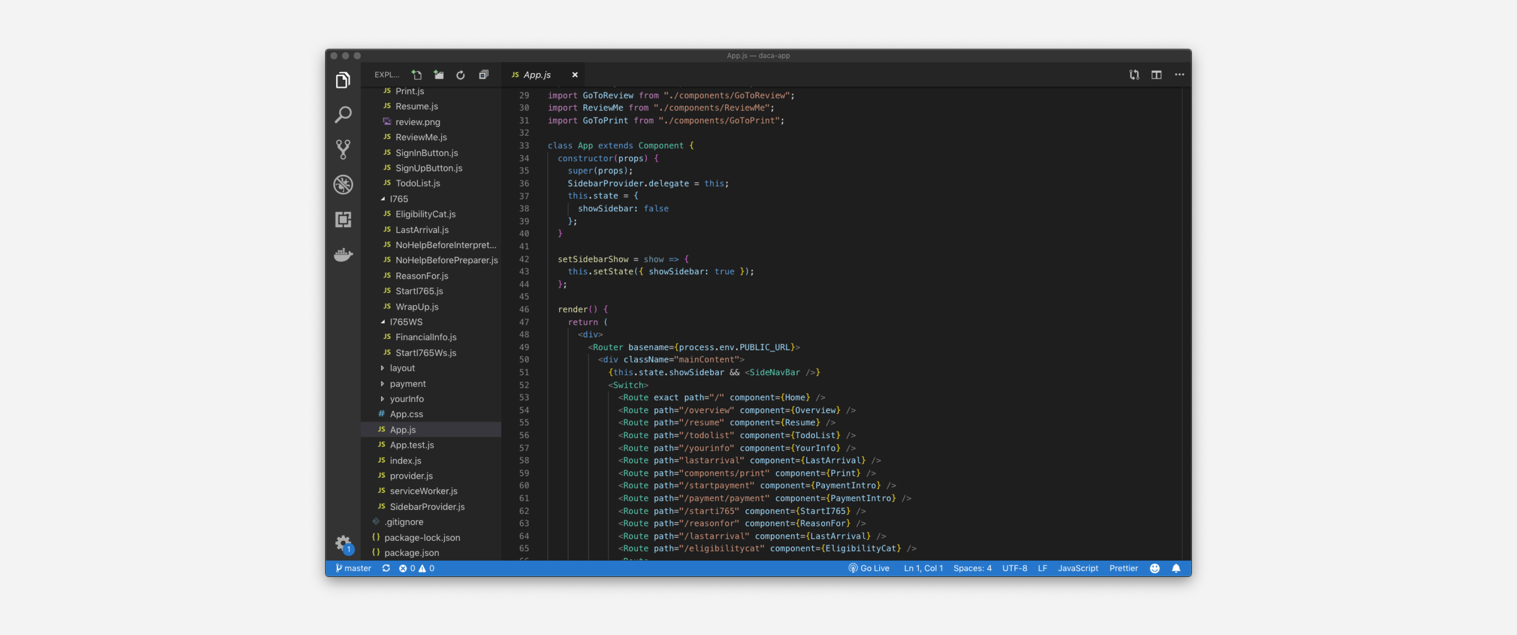
Development
The site is currently being developed with React and Bootstrap.
Team
- RESEARCHER, UX DESIGNER, DEVELOPER
- Sebastian Torres Retana
- UX & UI DESIGNER, DEVELOPER
- Timothy Sun